Education
Expert-driven articles and videos about saving and investing.

Go to topic
Featured
Most Recent Posts
-
How Betterment manages risks in your portfolio
How Betterment manages risks in your portfolio Betterment’s tools can keep you on track with the best chance of reaching your goals. Investing always involves some level of risk. But you should always have control over how much risk you take on. When your goals are decades away, it's easier to invest in riskier assets. The closer you get to reaching your goals, the more you may want to play it safe. Betterment’s tools can help manage risk and keep you on track toward your goals. In this guide, we’ll: Explain how Betterment provides allocation advice Talk about determining your personal risk level Walk through some of Betterment’s automated tools that help you manage risk Take a look at low-risk portfolios The key to managing your risk: asset allocation Risk is inherent to investing, and to some degree risk is good. High risk, high reward, right? What’s important is how you manage your risk. You want your investments to grow as the market fluctuates. One major way investors manage risk is through diversification. You’ve likely heard the old cliche, “Don’t put all your eggs in one basket.” This is the same reasoning investors use. We diversify our investments, putting our eggs in various baskets, so to speak. This way if one investment fails, we don’t lose everything. But how do you choose which baskets to put your eggs in? And how many eggs do you put in those baskets? Investors have a name for this process: asset allocation. Asset allocation involves splitting up your investment dollars across several types of financial assets (like stocks and bonds). Together these investments form your portfolio. A good portfolio will have your investment dollars in the right baskets: protecting you from extreme loss when the markets perform poorly, yet leaving you open to windfalls when the market does well. If that sounds complicated, there’s good news: Betterment will automatically recommend how to allocate your investments based on your individual goals. How Betterment provides allocation advice At Betterment, our recommendations start with your financial goals. Each of your financial goals—whether it’s a vacation or retirement—gets its own allocation primarily of stocks and bonds. Next we look at your investment horizon, a fancy term for “when you need the money and how you’ll withdraw it.” It’s like a timeline. How long will you invest for? Will you take it out all at once, or a little bit at a time? For a down payment goal, you might withdraw the entire investment after 10 years once you’ve hit your savings mark. But when you retire, you’ll probably withdraw from your retirement account gradually over the course of years. What if you don’t have a defined goal? If you’re investing without a timeline or target amount, we’ll use your age to set your investment horizon with a default target date of your 65th birthday. We’ll assume you’ll withdraw from it like a retirement account, but maintain a slightly riskier portfolio even when you hit the target date, since you haven’t decided when you'll liquidate those investments. But you’re not a “default” person. So why would you want a default investment plan? That’s why you should have a goal. When we know your goal and time horizon, we can determine the best risk level by assessing possible outcomes across a range of bad to average markets. Our projection model includes many possible futures, weighted by how likely we believe each to be. By some standards, we err on the side of caution with a fairly conservative allocation model. Our mission is to help you get to your goal through steady saving and appropriate allocation, rather than taking on unnecessary risk. How much risk should you take on? Your investment horizon is one of the most important factors in determining your risk level. The more time you have to reach your investing goals, the more risk you can afford to safely take. So generally speaking, the closer you are to reaching your goal, the less risk your portfolio should be exposed to. This is why we use the Betterment auto-adjust—a glide path (aka formula) used for asset allocation that becomes more conservative as your target date approaches. We adjust the recommended allocation and portfolio weights of the glide path based on your specific goal and time horizon. Want to take a more aggressive approach? More conservative? That’s totally ok. You’re in control. You always have the final say on your allocation, and we can show you the likely outcomes. Our quantitative approach helps us establish a set of recommended risk ranges based on your goals. If you choose to deviate from our risk guidance, we’ll provide you with feedback on the potential implications. Take more risk than we recommend, and we’ll tell you we believe your approach is “too aggressive” given your goal and time horizon. Even if you care about the downsides less than the average outcome, we’ll still caution you against taking on more risk, because it can be very difficult to recover from losses in a portfolio flagged as “too aggressive.” On the other hand, if you choose a lower risk level than our “conservative” band, we'll label your choice “very conservative.” A downside to taking a lower risk level is you may need to save more. You should choose a level of risk that’s aligned with your ability to stay the course. An allocation is only optimal if you’re able to commit to it in both good markets and bad ones. To ensure you’re comfortable with the short-term risk in your portfolio, we present both extremely good and extremely poor return scenarios for your selection over a one-year period. How Betterment automatically optimizes your risk An advantage of investing with Betterment is that our technology works behind the scenes to automatically manage your risk in a variety of ways, including auto-adjusted allocation and rebalancing. Auto-adjusted allocation For most goals, the ideal allocation will change as you near your goal. Our automated tools aim to make those adjustments as efficient and tax-friendly as possible. Deposits, withdrawals, and dividends can help us guide your portfolio toward the target allocation. And when selling any of your investments, our tax-smart technology is designed to minimize the potential tax impact. First we look for shares that have losses. These can offset other taxes. Then we sell shares with the smallest embedded gains (and smallest potential taxes). Rebalancing Over time, individual assets in a diversified portfolio move up and down in value, drifting away from the target weights that help achieve proper diversification. The difference between your target allocation and the actual weights in your current ETF portfolio is called portfolio drift. We define portfolio drift as the total absolute deviation of each super asset class from its target, divided by two. These super asset classes are US Bonds, International Bonds, Emerging Markets Bonds, US Stocks, International Stocks, and Emerging Markets Stocks. For Betterment-constructed portfolios that include a cash allocation, drift in the cash allocation is measured alongside super asset class drift. (Separately, Betterment-managed custom portfolios evaluate drift at the security group level. For reference, security groups are groupings of tickers that include a primary ticker, and may include secondary and/or tertiary tickers designed to help avoid wash sales and allow for tax-loss harvesting opportunities). A high drift may expose you to more (or less) risk than you intended when you set the target allocation. Betterment automatically monitors your account for rebalancing opportunities to reduce drift. There are several different methods depending on the circumstances: First, in response to cash flows such as deposits, withdrawals, and dividend reinvestments, Betterment buys underweight holdings and sells overweight holdings. This reactive rebalancing generally occurs when cash flows going into or out of the portfolio are already happening. We use inflows (like deposits and dividend reinvestments) to buy asset classes that are under-weight. This reduces the need to sell, which in turn reduces potential capital gains taxes. And we use outflows (like withdrawals) by seeking to first sell asset classes that are overweight. Second, if cash flows are not sufficient to keep a client’s portfolio drift within its applicable drift tolerance (such parameters as disclosed in Betterment’s Form ADV), automated rebalancing sells overweight holdings in order to buy underweight ones, aligning the portfolio more closely with its target allocation. This proactive rebalancing reshuffles assets that are already in the portfolio, and requires a minimum portfolio balance (clients can review the estimated balance at www.betterment.com/legal/portfolio-minimum). The rebalancing algorithm is also calibrated to avoid frequent small rebalance transactions and to seek tax efficient outcomes, such as helping to reduce wash sales and minimizing short-term capital gains. Allocation change rebalancing occurs when you change your target allocation. This sells securities and could possibly realize capital gains, but we still utilize our tax minimization algorithm to help reduce the tax impact. We’ll let you know the potential tax impact before you confirm your allocation change. Once you confirm it, we’ll rebalance to your new target with minimized drift. When Betterment rebalances a portfolio with a cash allocation, the rebalancing algorithm will first seek to bring the portfolio's cash allocation back to its target before investing in securities. If cash is below its target allocation, rebalancing will first use available funds (e.g., deposits, dividends, and/or proceeds from selling overweight holdings) to increase cash up to target, and only any remaining available cash is invested in securities; conversely, if cash is above its target allocation, the excess cash above target will be invested in securities as a part of the rebalancing transaction. If you are an Advised client, rebalancing in your account may function differently depending on the customizations your Advisor has selected for your portfolio. We recommend reaching out to your Advisor for further details. For more information, please review our rebalancing disclosures. How Betterment reduces risk in portfolios Investments like short-term US treasuries can help reduce risk in portfolios. At a certain point, however, including assets such as these in a portfolio no longer improves returns for the amount of risk taken. For Betterment, this point is our 60% stock portfolio. Portfolios with a stock allocation of 60% or more don’t incorporate these exposures. We include our U.S. Ultra-Short Income ETF and our U.S. Short-Term Treasury Bond ETF in the portfolio at stock allocations below 60% for both the IRA and taxable versions of the Betterment Core portfolio strategy. If your portfolio includes no stocks (meaning you allocated 100% of your portfolio’s investments to bonds), we can take the hint. You likely don’t want to worry about market volatility. So in that case, we recommend that you invest everything in these ETFs. At 0% stocks, a Betterment Core portfolio generally consists of 60% U.S. short-term treasury bonds, 20% U.S. short-term high quality bonds, and 20% inflation protected bonds.* Increase the stock allocation in your portfolio, and we’ll decrease the allocation to these exposures. Reach the 60% stock allocation threshold, and we’ll remove these funds from the recommended portfolio. At that allocation, they decrease expected returns given the desired risk of the overall portfolio. Short-term U.S. treasuries generally have lower volatility (any price swings are quite mild) and smaller drawdowns (shorter, less significant periods of loss). The same can be said for short-term high quality bonds, but they are slightly more volatile. It’s also worth noting that these asset classes don’t always go down at exactly the same time. By combining these asset classes, we’re able to produce a portfolio with a higher potential yield while maintaining relatively lower volatility. As with other assets, the returns for assets such as high quality bonds include both the possibility of price returns and income yield. Generally, price returns are expected to be minimal, with the primary form of returns coming from the income yield. The yields you receive from the ETFs in Betterment’s 0% stocks portfolio are the actual yields of the underlying assets after fees. Since we’re investing directly in funds that are paying prevailing market rates, you can feel confident that the yield you receive is fair and in line with prevailing rates. Work toward your financial goals without risking it all Choosing an investment portfolio is a personal decision, but it doesn’t have to be a difficult one. At Betterment, our goal is to help you feel confident that you’re always taking an appropriate amount of risk. We’ll help you select a portfolio with the risk level that’s right for you, and you can rest assured that our automated services are built to manage it efficiently. *Target investments, actual holdings will vary.
-
Betterment's asset location methodology
Betterment's asset location methodology Intelligently applying asset location to a globally diversified portfolio is a complex, mathematically rigorous, and continuous undertaking. TABLE OF CONTENTS Summary Part I: Introduction to Asset Location Part II: After-Tax Return—Deep Dive Part III: Asset Location Myths Part IV: TCP Methodology Part V: Monte Carlo on the Amazon—Betterment’s Testing Framework Part VI: Results Part VII: Special Considerations Addendum Summary Asset location is widely regarded as the closest thing there is to a "free lunch" in the wealth management industry.1 When investments are held in at least two types of accounts (out of three possible types: taxable, tax-deferred and tax-exempt), asset location provides the ability to deliver additional after-tax return potential, while maintaining the same level of risk. Generally speaking, this benefit is achieved by placing the least tax-efficient assets in the accounts taxed most favorably, and the most tax-efficient assets in the accounts taxed least favorably, all while maintaining the desired asset allocation in the aggregate. Part I: Introduction to Asset Location Maximizing after-tax return on investments can be complex. Still, most investors know that contributing to tax-advantaged (or "qualified") accounts is a relatively straightforward way to pay less tax on their retirement savings. Millions of Americans wind up with some combination of IRAs and 401(k) accounts, both available in two types: traditional or Roth. Many will only save in a taxable account once they have maxed out their contribution limits for the qualified accounts. But while tax considerations are paramount when choosing which account to fund, less thought is given to the tax impact of which investments to then purchase across all accounts. The tax profiles of the three account types (taxable, traditional, and Roth) have implications for what to invest in, once the account has been funded. Choosing wisely can significantly improve the after-tax value of one’s savings, when more than one account is in the mix. Almost universally, such investors can benefit from a properly executed asset location strategy. The idea behind asset location is fairly straightforward. Certain investments generate their returns in a more tax-efficient manner than others. Certain accounts shelter investment returns from tax better than others. Placing, or "locating" less tax-efficient investments in tax-sheltered accounts could increase the after-tax value of the overall portfolio. Allocate First, Locate Second Let’s start with what asset location isn’t. All investors must select a mix of stocks and bonds, finding an appropriate balance of risk and expected potential return, in line with their goals. One common goal is retirement, in which case, the mix of assets should be tailored to match the investor’s time horizon. This initial determination is known as "asset allocation," and it comes first. When investing in multiple accounts, it is common for investors to simply recreate their desired asset allocation in each account. If each account, no matter the size, holds the same assets in the same proportions, adding up all the holdings will also match the desired asset allocation. If all these funds, however scattered, are invested towards the same goal, this is the right result. The aggregate portfolio is the one that matters, and it should track the asset allocation selected for the common goal. Portfolio Managed Separately in Each Account Enter asset location, which can only be applied once a desired asset allocation is selected. Each asset’s after-tax return is considered in the context of every available account. The assets are then arranged (unequally) across all coordinated accounts to help maximize the after-tax performance of the overall portfolio. Same Portfolio Overall—With Asset Location To help conceptualize asset location, consider a team of runners. Some runners compete better on a track than a cross-country dirt path, as compared to their more versatile teammates. Similarly, certain asset classes can benefit more than others from the tax-efficient "terrain" of a qualified account. Asset allocation determines the composition of the team, and the overall portfolio’s after-tax return is a team effort. Asset location then seeks to match up asset and environment in a way that maximizes the overall result over time, while keeping the composition of the team intact. TCP vs. TDF The primary appeal of a target-date fund (TDF) is the "set it and forget it" simplicity with which it allows investors to select and maintain a diversified asset allocation, by purchasing only one fund. That simplicity comes at a price—because each TDF is a single, indivisible security, it cannot unevenly distribute its underlying assets across multiple accounts, and thus cannot deliver the additional after-tax returns of asset location. In particular, participants who are locked into 401(k) plans without automated management may find that a cheap TDF is still their best "hands off" option (plus, a TDF’s ability to satisfy the Qualified Default Investment Alternative (QDIA) requirement under ERISA ensures its baseline survival under current law). Participants in a Betterment at Work plan can already enable Betterment’s Tax-Coordinated Portfolio feature (“TCP”) to manage a single portfolio across their 401(k), IRAs and taxable accounts they individually have with Betterment, designed to squeeze additional after-tax returns from their aggregate long-term savings. Automated asset location (when integrated with automated asset allocation) replicates what makes a TDF so appealing, but effectively amounts to a "TDF 2.0"—a continuously managed portfolio, but one that can straddle multiple accounts for tax benefits. Next, we dive into the complex dynamics that need to be considered when seeking to optimize the after-tax return of a diversified portfolio. Part II: After-Tax Return—Deep Dive A good starting point for a discussion of investment taxation is the concept of "tax drag." Tax drag is the portion of the return that is lost to tax on an annual basis. In particular, funds pay dividends, which are taxed in the year they are received. However, there is no annual tax in qualified accounts, also sometimes known as "tax-sheltered accounts." Therefore, placing assets that pay a substantial amount of dividends into a qualified account, rather than a taxable account, "shelters" those dividends, and reduces tax drag. Reducing the tax drag of the overall portfolio is one way that asset location improves the portfolio’s potential after-tax return. Importantly, investments are also subject to tax at liquidation, both in the taxable account, and in a traditional IRA (where tax is deferred). However, "tax drag", as that term is commonly used, does not include liquidation tax. So while the concept of "tax drag" is intuitive, and thus a good place to start, it cannot be the sole focus when looking to help minimize taxes. What is "Tax Efficiency" A closely related term is "tax efficiency" and this is one that most discussions of asset location will inevitably focus on. A tax-efficient asset is one that has minimal "tax drag." Prioritizing assets on the basis of tax efficiency allows for asset location decisions to be made following a simple, rule-based approach. Both "tax drag" and "tax efficiency" are concepts pertaining to taxation of returns in a taxable account. Therefore, we first consider that account, where the rules are most elaborate. With an understanding of these rules, we can layer on the impact of the two types of qualified accounts. Returns in a Taxable Account There are two types of investment income, and two types of applicable tax rates. Two types of investment tax rates. All investment income in a taxable brokerage account is subject to one of two rate categories (with material exceptions noted). For simplicity, and to keep the analysis universal, this section only addresses federal tax (state tax is considered when testing for performance). Ordinary rate: For most, this rate mirrors the marginal tax bracket applicable to earned income (primarily wages reported on a W-2). Preferential rate: This more favorable rate ranges from 15% to 20% for most investors. For especially high earners, both rates are subject to an additional tax of 3.8%. Two types of investment returns. Investments generate returns in two ways: by appreciating in value, and by making cash distributions. Capital gains: When an investment is sold, the difference between the proceeds and the tax basis (generally, the purchase price) is taxed as capital gains. If held for longer than a year, this gain is treated as long-term capital gains (LTCG) and taxed at the preferential rate. If held for a year or less, the gain is treated as short-term capital gains (STCG), and taxed at the ordinary rate. Barring unforeseen circumstances, passive investors should be able to avoid STCG entirely. Betterment’s automated account management seeks to avoid STCG when possible,4 and the rest of this paper assumes only LTCG on liquidation of assets. Dividends: Bonds pay interest, which is taxed at the ordinary rate, whereas stocks pay dividends, which are taxed at the preferential rate (both subject to the exceptions below). An exchange-traded fund (ETF) pools the cash generated by its underlying investments, and makes payments that are called dividends, even if some or all of the source was interest. These dividends inherit the tax treatment of the source payments. This means that, generally, a dividend paid by a bond ETF is taxed at the ordinary rate, and a dividend paid by a stock ETF is taxed at the preferential rate. Qualified Dividend Income (QDI): There is an exception to the general rule for stock dividends. Stock dividends enjoy preferential rates only if they meet the requirements of qualified dividend income (QDI). Key among those requirements is that the company issuing the dividend must be a U.S. corporation (or a qualified foreign corporation). A fund pools dividends from many companies, only some of which may qualify for QDI. To account for this, the fund assigns itself a QDI percentage each year, which the custodian uses to determine the portion of the fund’s dividends that are eligible for the preferential rate. For stock funds tracking a U.S. index, the QDI percentage is typically 100%. However, funds tracking a foreign stock index will have a lower QDI percentage, sometimes substantially. For example, VWO, Vanguard’s Emerging Markets Stock ETF, had a QDI percentage of 38% in 2015, which means that 38% of its dividends for the year were taxed at the preferential rate, and 62% were taxed at the ordinary rate. Tax-exempt interest: There is also an exception to the general rule for bonds. Certain bonds pay interest that is exempt from federal tax. Primarily, these are municipal bonds, issued by state and local governments. This means that an ETF which holds municipal bonds will pay a dividend that is subject to 0% federal tax—even better than the preferential rate. The table below summarizes these interactions. Note that this section does not consider tax treatment for those in a marginal tax bracket of 15% and below. These taxpayers are addressed in "Special Considerations." Dividends (taxed annually) Capital Gains (taxed when sold) Ordinary Rate Most bonds Non-QDI stocks (foreign) Any security held for a year or less (STCG) Preferential Rate QDI stocks (domestic and some foreign) Any security held for more than a year (LTCG) No Tax Municipal bonds Any security transferred upon death or donated to charity The impact of rates is obvious: The higher the rate, the higher the tax drag. Equally important is timing. The key difference between dividends and capital gains is that the former are taxed annually, contributing to tax drag, whereas tax on the latter is deferred. Tax deferral is a powerful driver of after-tax return, for the simple reason that the savings, though temporary, can be reinvested in the meantime, and compounded. The longer the deferral, the more valuable it is. Putting this all together, we arrive at the foundational piece of conventional wisdom, where the most basic approach to asset location begins and ends: Bond funds are expected to generate their return entirely through dividends, taxed at the ordinary rate. This return benefits neither from the preferential rate, nor from tax deferral, making bonds the classic tax-inefficient asset class. These go in your qualified account. Stock funds are expected to generate their return primarily through capital gains. This return benefits both from the preferential rate, and from tax deferral. Stocks are therefore the more tax-efficient asset class. These go in your taxable account. Tax-Efficient Status: It’s Complicated Reality gets messy rather quickly, however. Over the long term, stocks are expected to grow faster than bonds, causing the portfolio to drift from the desired asset allocation. Rebalancing may periodically realize some capital gains, so we cannot expect full tax deferral on these returns (although if cash flows exist, investing them intelligently can potentially reduce the need to rebalance via selling). Furthermore, stocks do generate some return via dividends. The expected dividend yield varies with more granularity. Small cap stocks pay relatively little (these are growth companies that tend to reinvest any profits back into the business) whereas large cap stocks pay more (as these are mature companies that tend to distribute profits). Depending on the interest rate environment, stock dividends can exceed those paid by bonds. International stocks pay dividends too, and complicating things further, some of those dividends will not qualify as QDI, and will be taxed at the ordinary rate, like bond dividends (especially emerging markets stock dividends). Returns in a Tax-Deferred Account (TDA) Compared to a taxable account, a TDA is governed by straightforward rules. However, earning the same return in a TDA involves trade-offs which are not intuitive. Applying a different time horizon to the same asset can swing our preference between a taxable account and a TDA.Understanding these dynamics is crucial to appreciating why an optimal asset location methodology cannot ignore liquidation tax, time horizon, and the actual composition of each asset’s expected return.Although growth in a traditional IRA or traditional 401(k) is not taxed annually, it is subject to a liquidation tax. All the complexity of a taxable account described above is reduced to two rules. First, all tax is deferred until distributions are made from the account, which should begin only in retirement. Second, all distributions are taxed at the same rate, no matter the source of the return. The rate applied to all distributions is the higher ordinary rate, except that the additional 3.8% tax will not apply to those whose tax bracket in retirement would otherwise be high enough.2 First, we consider income that would be taxed annually at the ordinary rate (i.e. bond dividends and non-QDI stock dividends). The benefit of shifting these returns to a TDA is clear. In a TDA, these returns will eventually be taxed at the same rate, assuming the same tax bracket in retirement. But that tax will not be applied until the end, and compounding due to deferral can only have a positive impact on the after-tax return, as compared to the same income paid in a taxable account.3 In particular, the risk is that LTCG (which we expect plenty of from stock funds) will be taxed like ordinary income. Under the basic assumption that in a taxable account, capital gains tax is already deferred until liquidation, favoring a TDA for an asset whose only source of return is LTCG is plainly harmful. There is no benefit from deferral, which you would have gotten anyway, and only harm from a higher tax rate. This logic supports the conventional wisdom that stocks belong in the taxable account. First, as already discussed, stocks do generate some return via dividends, and that portion of the return will benefit from tax deferral. This is obviously true for non-QDI dividends, already taxed as ordinary income, but QDI can benefit too. If the deferral period is long enough, the value of compounding will offset the hit from the higher rate at liquidation. Second, it is not accurate to assume that all capital gains tax will be deferred until liquidation in a taxable account. Rebalancing may realize some capital gains "prematurely" and this portion of the return could also benefit from tax deferral. Placing stocks in a TDA is a trade-off—one that must weigh the potential harm from negative rate arbitrage against the benefit of tax deferral. Valuing the latter means making assumptions about dividend yield and turnover. On top of that, the longer the investment period, the more tax deferral is worth. Kitces demonstrates that a dividend yield representing 25% of total return (at 100% QDI), and an annual turnover of 10%, could swing the calculus in favor of holding the stocks in a TDA, assuming a 30-year horizon.4 For foreign stocks with less than perfect QDI, we would expect the tipping point to come sooner. Returns in a Tax-Exempt Account (TEA) Qualifying investments in a Roth IRA or Roth 401(k) grow tax free, and are also not taxed upon liquidation. Since it eliminates all possible tax, a TEA presents a particularly valuable opportunity for maximizing after-tax return. The trade-off here is managing opportunity cost—every asset does better in a TEA, so how best to use its precious capacity? Clearly, a TEA is the most favorably taxed account. Conventional wisdom thus suggests that if a TEA is available, we use it to first place the least tax-efficient assets. But that approach is wrong. Everything Counts in Large Amounts—Why Expected Return Matters The powerful yet simple advantage of a TEA helps illustrate the limitation of focusing exclusively on tax efficiency when making location choices. Returns in a TEA escape all tax, whatever the rate or timing would have been, which means that an asset’s expected after-tax return equals its expected total return. When both a taxable account and a TEA are available, it may be worth putting a high-growth, low-dividend stock fund into the TEA, instead of a bond fund, even though the stock fund is vastly more tax-efficient. Similar reasoning can apply to placement in a TDA as well, as long as the tax-efficient asset has a large enough expected return, and presents some opportunity for tax deferral (i.e., some portion of the return comes from dividends). Part III: Asset Location Myths Urban Legend 1: Asset location is a one-time process. Just set it and forget it. While an initial location may add some value, doing it properly is a continuous process, and will require adjustments in response to changing conditions. Note that overlaying asset location is not a deviation from a passive investing philosophy, because optimizing for location does not mean changing the overall asset allocation (the same goes for tax loss harvesting). Other things that will change, all of which should factor into an optimal methodology: expected returns (both the risk-free rate, and the excess return), dividend yields, QDI percentages, and most importantly, relative account balances. Contributions, rollovers, and conversions can increase qualified assets relative to taxable assets, continuously providing more room for additional optimization. Urban Legend 2: Taking advantage of asset location means you should contribute more to a particular qualified account than you otherwise would. Definitely not! Asset location should play no role in deciding which accounts to fund. It optimizes around account balances as it finds them, and is not concerned with which accounts should be funded in the first place. Just because the presence of a TEA makes asset location more valuable, does not mean you should contribute to a TEA, as opposed to a TDA. That decision is primarily a bet on how your tax rate today will compare to your tax rate in retirement. To hedge, some may find it optimal to make contributions to both a TDA and TEA (this is called "tax diversification"). While these decisions are out of scope for this paper, Betterment’s retirement planning tools can help clients with these choices. Urban Legend 3: Asset location has very little value if one of your accounts is relatively small. It depends. Asset location will not do much for investors with a very small taxable balance and a relatively large balance in only one type of qualified account, because most of the overall assets are already sheltered. However, a large taxable balance and a small qualified account balance (especially a TEA balance) presents a better opportunity. Under these circumstances, there may be room for only the least tax-efficient, highest-return assets in the qualified account. Sheltering a small portion of the overall portfolio can deliver a disproportionate amount of value. Urban Legend 4: Asset location has no value if you are investing in both types of qualified accounts, but not in a taxable account. A TEA offers significant advantages over a TDA. Zero tax is better than a tax deferred until liquidation. While tax efficiency (i.e. annual tax drag) plays no role in these location decisions, expected returns and liquidation tax do. The assets we expect to grow the most should be placed in a TEA, and doing so will plainly increase the overall after-tax return. There is an additional benefit as well. Required minimum distributions (RMDs) apply to TDAs but not TEAs. Shifting expected growth into the TEA, at the expense of the TDA, will mean lower RMDs, giving the investor more flexibility to control taxable income down the road. In other words, a lower balance in the TDA can mean lower tax rates in retirement, if higher RMDs would have pushed the retiree into a higher bracket. This potential benefit is not captured in our results. Urban Legend 5: Bonds always go in the IRA. Possibly, but not necessarily. This commonly asserted rule is a simplification, and will not be optimal under all circumstances. It is discussed at more length below. Existing Approaches to Asset Location: Advantages and Limitations Optimizing for After-Tax Return While Maintaining Separate Portfolios One approach to increasing after-tax return on retirement savings is to maintain a separate, standalone portfolio in each account with roughly the same level of risk-adjusted return, but tailoring each portfolio somewhat to take advantage of the tax profile of the account. Effectively, this means that each account separately maintains the desired exposure to stocks, while substituting certain asset classes for others. Generally speaking, managing a fully diversified portfolio in each account means that there is no way to avoid placing some assets with the highest expected return in the taxable account. This approach does include a valuable tactic, which is to differentiate the high-quality bonds component of the allocation, depending on the account they are held in. The allocation to the component is the same in each account, but in a taxable account, it is represented by municipal bonds which are exempt from federal tax , and in a qualified account, by taxable investment grade bonds . This variation is effective because it takes advantage of the fact that these two asset classes have very similar characteristics (expected returns, covariance and risk exposures) allowing them to play roughly the same role from an asset allocation perspective. Municipal bonds are highly tax-efficient due to their federal tax-exempt interest income, making them particularly compelling for a taxable account. Taxable investment grade bonds have significant tax drag, and work best in a qualified account. Betterment has applied this substitution since 2014. The Basic Priority List Gobind Daryanani and Chris Cordaro sought to balance considerations around tax efficiency and expected return, and illustrated that when both are very low, location decisions with respect to those assets have very limited impact.5 That study inspired Michael Kitces, who leverages its insights into a more sophisticated approach to building a priority list.6 To visually capture the relationship between the two considerations, Kitces bends the one-dimensional list into a "smile." Asset Location Priority List Assets with a high expected return that are also very tax-efficient go in the taxable account. Assets with a high expected return that are also very tax-inefficient go in the qualified accounts, starting with the TEA. The "smile" guides us in filling the accounts from both ends simultaneously, and by the time we get to the middle, whatever decisions we make with respect to those assets just "don’t matter" much. However, Kitces augments the graph in short order, recognizing that the basic "smile" does not capture a third key consideration—the impact of liquidation tax. Because capital gains will eventually be realized in a taxable account, but not in a TEA, even a highly tax-efficient asset might be better off in a TEA, if its expected return is high enough. The next iteration of the "smile" illustrates this preference. Asset Location Priority List with Limited High Return Inefficient Assets Part IV: TCP Methodology There is no one-size-fits-all asset location for every set of inputs. Some circumstances apply to all investors, but shift through time—the expected return of each asset class (which combines separate assumptions for the risk-free rate and the excess return), as well as dividend yields, QDI percentages, and tax laws. Other circumstances are personal—which accounts the client has, the relative balance of each account, and the client’s time horizon. Solving for multiple variables while respecting defined constraints is a problem that can be effectively solved by linear optimization. This method is used to maximize some value, which is represented by a formula called an "objective function." What we seek to maximize is the after-tax value of the overall portfolio at the end of the time horizon. We get this number by adding together the expected after-tax value of every asset in the portfolio, but because each asset can be held in more than one account, each portion must be considered separately, by applying the tax rules of that account. We must therefore derive an account-specific expected after-tax return for each asset. Deriving Account-Specific After-Tax Return To define the expected after-tax return of an asset, we first need its total return (i.e., before any tax is applied). The total return is the sum of the risk-free rate (same for every asset) and the excess return (unique to every asset). Betterment derives excess returns using the Black-Litterman model as a starting point. This common industry method involves analyzing the global portfolio of investable assets and their proportions, and using them to generate forward-looking expected returns for each asset class. Next, we must reduce each total return into an after-tax return.7 The immediate problem is that for each asset class, the after-tax return can be different, depending on the account, and for how long it is held. In a TEA, the answer is simple—the after-tax return equals the total return—no calculation necessary. In a TDA, we project growth of the asset by compounding the total return annually. At liquidation, we apply the ordinary rate to all of the growth.8 We use what is left of the growth after taxes to derive an annualized return, which is our after-tax return. In a taxable account, we need to consider the dividend and capital gain component of the total return separately, with respect to both rate and timing. We project growth of the asset by taxing the dividend component annually at the ordinary rate (or the preferential rate, to the extent that it qualifies as QDI) and adding back the after-tax dividend (i.e., we reinvest it). Capital gains are deferred, and the LTCG is fully taxed at the preferential rate at the end of the period. We then derive the annualized return based on the after-tax value of the asset.9 Note that for both the TDA and taxable calculations, time horizon matters. More time means more value from deferral, so the same total return can result in a higher annualized after-tax return. Additionally, the risk-free rate component of the total return will also depend on the time horizon, which affects all three accounts. Because we are accounting for the possibility of a TEA, as well, we actually have three distinct after-tax returns, and thus each asset effectively becomes three assets, for any given time horizon (which is specific to each Betterment customer). The Objective Function To see how this comes together, we first consider an extremely simplified example. Let’s assume we have a taxable account, both a traditional and Roth account, with $50,000 in each one, and a 30-year horizon. Our allocation calls for 70% equities (stocks), so with a total portfolio value of $150,000, we need $105,000 of stocks. 1. These are constants whose value we already know (as derived above). req,tax is the after-tax return of stocks in the taxable account, over 30 years req,trad is the after-tax return of stocks in the traditional account, over 30 years req,roth is the after-tax return of stocks in the Roth account, over 30 years rfi,tax is the after-tax return of bonds in the taxable account, over 30 years rfi,trad is the after-tax return of bonds in the traditional account, over 30 years rfi,roth is the after-tax return of bonds in the Roth account, over 30 years 2. These are the values we are trying to solve for (called "decision variables"). xeq,tax is the amount of stocks we will place in the taxable account xeq,trad is the amount of stocks we will place in the traditional account xeq,roth is the amount of stocks we will place in the Roth account xfi,tax is the amount of bonds we will place in the taxable account xfi,trad is the amount of bonds we will place in the traditional account xfi,roth is the amount of bonds we will place in the Roth account 3. These are the constraints which must be respected. All positions for each asset must add up to what we have allocated to the asset overall. All positions in each account must add up to the available balance in each account. xeq,tax + xeq,trad + xeq,roth = 105,000 xfi,tax + xfi,trad + xfi,roth = 45,000 xeq,tax + xfi,tax = 50,000 xeq,trad + xfi,trad = 50,000 xeq,roth + xfi,roth = 50,000 4. This is the objective function, which uses the constants and decision variables to express the after-tax value of the entire portfolio, represented by the sum of six terms (the after-tax value of each asset in each of the three accounts). maxx req,taxxeq,tax + req,tradxeq,trad + req,rothxeq,roth + rfi,taxxfi,tax + rfi,tradxfi,trad + rfi,rothxfi,roth Linear optimization turns all of the above into a complex geometric representation, and mathematically closes in on the optimal solution. It assigns values for all decision variables in a way that maximizes the value of the objective function, while respecting the constraints. Accordingly, each decision variable is a precise instruction for how much of which asset to put in each account. If a variable comes out as zero, then that particular account will contain none of that particular asset. An actual Betterment portfolio can potentially have twelve asset classes,15 depending on the allocation. That means TCP must effectively handle up to 36 "assets," each with its own after-tax return. However, the full complexity behind TCP goes well beyond increasing assets from two to twelve. Updated constants and constraints will trigger another part of the optimization, which determines what TCP is allowed to sell, in order to move an already coordinated portfolio toward the newly optimal asset location, while minimizing taxes. Reshuffling assets in a TDA or TEA is "free" in the sense that no capital gains will be realized.10 In the taxable account, however, TCP will attempt to move as close as possible towards the optimal asset location without realizing capital gains. Expected returns will periodically be updated, either because the risk-free rate has been adjusted, or because new excess returns have been derived via Black-Litterman. Future cash flows may be even more material. Additional funds in one or more of the accounts could significantly alter the constraints which define the size of each account, and the target dollar allocation to each asset class. Such events (including dividend payments, subject to a de minimis threshold) will trigger a recalculation, and potentially a reshuffling of the assets. Cash flows, in particular, can be a challenge for those managing their asset location manually. Inflows to just one account (or to multiple accounts in unequal proportions) create a tension between optimizing asset location and maintaining asset allocation, which is hard to resolve without mathematical precision. To maintain the overall asset allocation, each position in the portfolio must be increased pro-rata. However, some of the additional assets we need to buy "belong" in other accounts from an asset location perspective, even though new cash is not available in those accounts. If the taxable account can only be partially reshuffled due to built-in gains, we must choose either to move farther away from the target allocation, or the target location.11 With linear optimization, our preferences can be expressed through additional constraints, weaving these considerations into the overall problem. When solving for new cash flows, TCP penalizes allocation drift higher than it does location drift. Against this background, it is important to note that expected returns (the key input into TCP, and portfolio management generally) are educated guesses at best. No matter how airtight the math, reasonable people will disagree on the "correct" way to derive them, and the future may not cooperate, especially in the short-term. There is no guarantee that any particular asset location will add the most value, or even any value at all. But given decades, the likelihood of this outcome grows. For portfolios that include a cash allocation, Betterment locates the entire cash allocation in the taxable account within the Tax-Coordinated Portfolio first, consistent with our asset location approach of reserving tax-advantaged accounts for assets with higher expected returns. If the portfolio does not include a taxable account, cash will be located in a traditional IRA before a Roth IRA. Tax-Coordinated Portfolios that include a 401(k) will not include a cash allocation. Part V: Monte Carlo—Betterment’s Testing Framework To test the output of the linear optimization method, we turned to a Monte Carlo testing framework,12 built entirely in-house by Betterment’s experts. The forward-looking simulations model the behavior of the TCP strategy down to the individual lot level. We simulate the paths of these lots, accounting for dividend reinvestment, rebalancing, and taxation. The simulations applied Betterment’s rebalancing methodology, which corrects drift from the target asset allocation in excess of the applicable drift threshold once the account balances meet or exceed the required minimum, but stops short of realizing STCG, when possible. Betterment’s management fees were assessed in all accounts, and ongoing taxes were paid annually from the taxable account. All taxable sales first realized available losses before touching LTCG. The simulations assume no additional cash flows other than dividends. This is not because we do not expect them to happen. Rather, it is because making assumptions around these very personal circumstances does nothing to isolate the benefit of TCP specifically. Asset location is driven by the relative sizes of the accounts, and cash flows will change these ratios, but the timing and amount is highly specific to the individual.19 Avoiding the need to make specific assumptions here helps keep the analysis more universal. We used equal starting balances for the same reason.13 For every set of assumptions, we ran each market scenario while managing each account as a standalone (uncoordinated) Betterment portfolio as the benchmark.14 We then ran the same market scenarios with TCP enabled. In both cases, we calculated the after-tax value of the aggregate portfolio after full liquidation of invested assets at the end of the period.15 Then, for each market scenario, we calculated the after-tax annualized internal rates of return (IRR) and subtracted the benchmark IRR from the TCP IRR. That delta represents the incremental tax alpha of TCP for that scenario. The median of those deltas across all market scenarios is the estimated tax alpha we present below for each set of assumptions. Part VI: Results More Bonds, More Alpha A higher allocation to bonds leads to a dramatically higher benefit across the board. This makes sense—the heavier your allocation to tax-inefficient assets, the more asset location can do for you. To be extremely clear: this is not a reason to select a lower allocation to stocks! Over the long-term, we expect a higher stock allocation to return more (because it’s riskier), both before, and after tax. These are measurements of the additional return due to TCP, which say nothing about the absolute return of the asset allocation itself. Conversely, a very high allocation to stocks shows a smaller (though still real) benefit. However, younger customers invested this aggressively should gradually reduce risk as they get closer to retirement (to something more like 50% stocks). Looking to a 70% stock allocation is therefore an imperfect but reasonable way to generalize the value of the strategy over a 30-year period. More Roth, More Alpha Another pattern is that the presence of a Roth makes the strategy more valuable. This also makes sense—a taxable account and a TEA are on opposite ends of the "favorably taxed" spectrum, and having both presents the biggest opportunity for TCP’s "account arbitrage." But again, this benefit should not be interpreted as a reason to contribute to a TEA over a TDA, or to shift the balance between the two via a Roth conversion. These decisions are driven by other considerations. TCP’s job is to optimize the relative balances as it finds them. Enabling TCP On Existing Taxable Accounts TCP should be enabled before the taxable account is funded, meaning that the initial location can be optimized without the need to sell potentially appreciated assets. A Betterment customer with an existing taxable account who enables TCP should not expect the full incremental benefit, to the extent that assets with built-in capital gains need to be sold to achieve the optimal location. This is because TCP conservatively prioritizes avoiding a certain tax today, over potentially reducing tax in the future. However, the optimization is performed every time there is a deposit (or dividend) to any account. With future cash flows, the portfolio will move closer to whatever the optimal location is determined to be at the time of the deposit. Part VII: Special Considerations Low Bracket Taxpayers: Beware Taxation of investment income is substantially different for those who qualify for a marginal tax bracket of 15% or below. To illustrate, we have modified the chart from Part II to apply to such low bracket taxpayers. Dividends Capital Gains Ordinary Rate N/A Any security held for a year or less (STCG) Preferential Rate N/A N/A No Tax Qualified dividends from any security are not taxed Any security held for a year or more is not taxed (LTCG) TCP is not designed for these investors. Optimizing around this tax profile would reverse many assumptions behind TCP’s methodology. Municipal bonds no longer have an advantage over other bond funds. The arbitrage opportunity between the ordinary and preferential rate is gone. In fact, there’s barely tax of any kind. It is quite likely that such investors would not benefit much from TCP, and may even reduce their overall after-tax return. If the low tax bracket is temporary, TCP over the long-term may still make sense. Also note that some combinations of account balances can, in certain circumstances, still add tax alpha for investors in low tax brackets. One example is when an investor only has traditional and Roth IRA accounts, and no taxable accounts being tax coordinated. Low bracket investors should very carefully consider whether TCP is suitable for them. As a general rule, we do not recommend it. Potential Problems with Coordinating Accounts Meant for Different Time Horizons We began with the premise that asset location is sensible only with respect to accounts that are generally intended for the same purpose. This is crucial, because unevenly distributing assets will result in asset allocations in each account that are not tailored towards the overall goal (or any goal at all). This is fine, as long as we expect that all coordinated accounts will be available for withdrawals at roughly the same time (e.g. at retirement). Only the aggregate portfolio matters in getting there. However, uneven distributions are less diversified. Temporary drawdowns (e.g., the 2008 financial crisis) can mean that a single account may drop substantially more than the overall coordinated portfolio. If that account is intended for a short-term goal, it may not have a chance to recover by the time you need the money. Likewise, if you do not plan on depleting an account during your retirement, and instead plan on leaving it to be inherited for future generations, arguably this account has a longer time horizon than the others and should thus be invested more aggressively. In either case, we do not recommend managing accounts with materially different time horizons as a single portfolio. For a similar reason, you should avoid applying asset location to an account that you expect will be long-term, but one that you may look to for emergency withdrawals. For example, a Safety Net Goal should never be managed by TCP. Large Upcoming Transfers/Withdrawals If you know you will be making large transfers in or out of your tax-coordinated accounts, you may want to delay enabling our tax coordination tool until after those transfers have occurred. This is because large changes in the balances of the underlying accounts can necessitate rebalancing, and thus may cause taxes. With incoming deposits, we can intelligently rebalance your accounts by increasing the allocation of asset classes that are underweight. But when large withdrawals or transfers out are made, despite Betterment’s intelligent management of executing trades, some taxes can be unavoidable when rebalancing to your overall target allocation. The only exception to this rule is if the large deposit will be in your taxable account instead of your IRAs. In that case, you should enable tax-coordination before depositing money into the taxable account. This is so our system knows to tax-coordinate you immediately. The goal of tax coordination is to reduce the drag taxes have on your investments, not cause additional taxes. So if you know an upcoming withdrawal or outbound transfer could cause rebalancing, and thus taxes, it would be prudent to delay enabling tax coordination until you have completed those transfers. Mitigating Behavioral Challenges Through Design There is a broader issue that stems from locating assets with different volatility profiles at the account level, but it is behavioral. Uncoordinated portfolios with the same allocation move together. Asset location, on the other hand, will cause one account to dip more than another, testing an investor’s stomach for volatility. Those who enable TCP across their accounts should be prepared for such differentiated movements. Rationally, we should ignore this—after all, the overall allocation is the same—but that is easier said than done. How TCP Interacts with Tax Loss Harvesting TCP and TLH work in tandem, seeking to minimize tax impact. As described in more detail below, the precise interaction between the two strategies is highly dependent on personal circumstances. While it is possible that enabling a TCP may reduce harvest opportunities, both TLH and TCP derive their benefit without disturbing the desired asset allocation. Operational Interaction TLH was designed around a "tertiary ticker" system, which ensures that no purchase in an IRA or 401(k) managed by Betterment will interfere with a harvested loss in a Betterment taxable account. A sale in a taxable account, and a subsequent repurchase of the same asset class in a qualified account would be incidental for accounts managed as separate portfolios. Under TCP, however, we expect this to occasionally happen by design. When "relocating" assets, either during initial setup, or as part of ongoing optimization, TCP will sell an asset class in one account, and immediately repurchase it in another. The tertiary ticker system allows this reshuffling to happen seamlessly, while attempting to protect any tax losses that are realized in the process. Conceptualizing Blended Performance TCP will affect the composition of the taxable account in ways that are hard to predict, because its decisions will be driven by changes in relative balances among the accounts. Meanwhile, the weight of specific asset classes in the taxable account is a material predictor of the potential value of TLH (more volatile assets should offer more harvesting opportunities). The precise interaction between the two strategies is far more dependent on personal circumstances, such as today’s account balance ratios and future cash flow patterns, than on generally applicable inputs like asset class return profiles and tax rules. These dynamics are best understood as a hierarchy. Asset allocation comes first, and determines what mix of asset classes we should stick to overall. Asset location comes second, and continuously generates tax alpha across all coordinated accounts, within the constraints of the overall portfolio. Tax loss harvesting comes third, and looks for opportunities to generate tax alpha from the taxable account only, within the constraints of the asset mix dictated by asset location for that account. TLH is usually most effective in the first several years after an initial deposit to a taxable account. Over decades, however, we expect it to generate value only from subsequent deposits and dividend reinvestments. Eventually, even a substantial dip is unlikely to bring the market price below the purchase price of the older tax lots. Meanwhile, TCP aims to deliver tax alpha over the entire balance of all three accounts for the entire holding period. *** Betterment does not represent in any manner that TCP will result in any particular tax consequence or that specific benefits will be obtained for any individual investor. The TCP service is not intended as tax advice. Please consult your personal tax advisor with any questions as to whether TCP is a suitable strategy for you in light of your individual tax circumstances. Please see our Tax-Coordinated Portfolio Disclosures for more information. Addendum As of May 2020, for customers who indicate that they’re planning on using a Health Savings Account (HSA) for long-term savings, we allow the inclusion of their HSA in their Tax-Coordinated Portfolio. If an HSA is included in a Tax-Coordinated Portfolio, we treat it essentially the same as an additional Roth account. This is because funds within an HSA grow income tax-free, and withdrawals can be made income tax-free for medical purposes. With this assumption, we also implicitly assume that the HSA will be fully used to cover long-term medical care spending. The tax alpha numbers presented above have not been updated to reflect the inclusion of HSAs, but remain our best-effort point-in-time estimate of the value of TCP at the launch of the feature. As the inclusion of HSAs allows even further tax-advantaged contributions, we contend that the inclusion of HSAs is most likely to additionally benefit customers who enable TCP. 1"Boost Your After-Tax Investment Returns." Susan B. Garland. Kiplinger.com, April 2014. 2But see "How IRA Withdrawals In The Crossover Zone Can Trigger The 3.8% Medicare Surtax," Michael Kitces, July 23, 2014. 3It is worth emphasizing that asset location optimizes around account balances as it finds them, and has nothing to say about which account to fund in the first place. Asset location considers which account is best for holding a specified dollar amount of a particular asset. However, contributions to a TDA are tax-deductible, whereas getting a dollar into a taxable account requires more than a dollar of income. 4Pg. 5, The Kitces Report. January/February 2014. 5Daryanani, Gobind, and Chris Cordaro. 2005. "Asset Location: A Generic Framework for Maximizing After-Tax Wealth." Journal of Financial Planning (18) 1: 44–54. 6The Kitces Report, March/April 2014. 7While the significance of ordinary versus preferential tax treatment of income has been made clear, the impact of an individual’s specific tax bracket has not yet been addressed. Does it matter which ordinary rate, and which preferential rate is applicable, when locating assets? After all, calculating the after-tax return of each asset means applying a specific rate. It is certainly true that different rates should result in different after-tax returns. However, we found that while the specific rate used to derive the after-tax return can and does affect the level of resulting returns for different asset classes, it makes a negligible difference on resulting location decisions. The one exception is when considering using very low rates as inputs (the implication of which is discussed under "Special Considerations"). This should feel intuitive: Because the optimization is driven primarily by the relative size of the after-tax returns of different asset classes, moving between brackets moves all rates in the same direction, generally maintaining these relationships monotonically. The specific rates do matter a lot when it comes to estimating the benefit of the asset location chosen, so rate assumptions are laid out in the "Results" section. In other words, if one taxpayer is in a moderate tax bracket, and another in a high bracket, their optimal asset location will be very similar and often identical, but the high bracket investor may benefit more from the same location. 8In reality, the ordinary rate is applied to the entire value of the TDA, both the principal (i.e., the deductible contributions) and the growth. However, this will happen to the principal whether we use asset location or not. Therefore, we are measuring here only that which we can optimize. 9TCP today does not account for the potential benefit of a foreign tax credit (FTC). The FTC is intended to mitigate the potential for double taxation with respect to income that has already been taxed in a foreign country. The scope of the benefit is hard to quantify and its applicability depends on personal circumstances. All else being equal, we would expect that incorporating the FTC may somewhat increase the after-tax return of certain asset classes in a taxable account—in particular developed and emerging markets stocks. If maximizing your available FTC is important to your tax planning, you should carefully consider whether TCP is the optimal strategy for you. 10Standard market bid-ask spread costs will still apply. These are relatively low, as Betterment considers liquidity as a factor in its investment selection process. Betterment customers do not pay for trades. 11Additionally, in the interest of making interaction with the tool maximally responsive, certain computationally demanding aspects of the methodology were simplified for purposes of the tool only. This could result in a deviation from the target asset location imposed by the TCP service in an actual Betterment account. 12Another way to test performance is with a backtest on actual market data. One advantage of this approach is that it tests the strategy on what actually happened. Conversely, a forward projection allows us to test thousands of scenarios instead of one, and the future is unlikely to look like the past. Another limitation of a backtest in this context—sufficiently granular data for the entire Betterment portfolio is only available for the last 15 years. Because asset location is fundamentally a long-term strategy, we felt it was important to test it over 30 years, which was only possible with Monte Carlo. Additionally, Monte Carlo actually allows us to test tweaks to the algorithm with some confidence, whereas adjusting the algorithm based on how it would have performed in the past is effectively a type of "data snooping". 13That said, the strategy is expected to change the relative balances dramatically over the course of the period, due to unequal allocations. We expect a Roth balance in particular to eventually outpace the others, since the optimization will favor assets with the highest expected return for the TEA. This is exactly what we want to happen. 14For the uncoordinated taxable portfolio, we assume an allocation to municipal bonds (MUB) for the high-quality bonds component, but use investment grade taxable bonds (AGG) in the uncoordinated portfolio for the qualified accounts. While TCP makes use of this substitution, Betterment has offered it since 2014, and we want to isolate the additional tax alpha of TCP specifically, without conflating the benefits. 15Full liquidation of a taxable or TDA portfolio that has been growing for 30 years will realize income that is guaranteed to push the taxpayer into a higher tax bracket. We assume this does not happen, because in reality, a taxpayer in retirement will make withdrawals gradually. The strategies around timing and sequencing decumulation from multiple account types in a tax-efficient manner are out of scope for this paper. Additional References Berkin. A. "A Scenario Based Approach to After-Tax Asset Allocation." 2013. Journal of Financial Planning. Jaconetti, Colleen M., CPA, CFP®. Asset Location for Taxable Investors, 2007. https://personal.vanguard.com/pdf/s556.pdf. Poterba, James, John Shoven, and Clemens Sialm. "Asset Location for Retirement Savers." November 2000. https://faculty.mccombs.utexas.edu/Clemens.Sialm/PSSChap10.pdf. Reed, Chris. "Rethinking Asset Location - Between Tax-Deferred, Tax-Exempt and Taxable Accounts." Accessed 2015. https://papers.ssrn.com/sol3/papers.cfm?abstract_id=2317970. Reichenstein, William, and William Meyer. "The Asset Location Decision Revisited." 2013. Journal of Financial Planning 26 (11): 48–55. Reichenstein, William. 2007. "Calculating After-Tax Asset Allocation is Key to Determining Risk, Returns, and Asset Location." Journal of Financial Planning (20) 7: 44–53.
-
Betterment's Socially Responsible Investing portfolios methodology
Betterment's Socially Responsible Investing portfolios methodology Learn how we construct our Socially Responsible Investing (SRI) portfolios. Table of Contents Introduction How do we define SRI? The Challenges of SRI Portfolio Construction How is Betterment’s Broad Impact portfolio constructed? How is Betterment’s Climate Impact portfolio constructed? How is Betterment’s Social Impact portfolio constructed? Conclusion Introduction Betterment launched its first Socially Responsible Investing (SRI) portfolio in 2017, and has widened the investment options under that umbrella since then. Within Betterment’s SRI options, we currently offer a Broad Impact portfolio and two additional, more focused SRI portfolio options: a Social Impact SRI portfolio (focused on social empowerment) and a Climate Impact SRI portfolio (focused on climate-conscious investments). These portfolios represent a diversified, relatively low-cost solution constructed using exchange traded funds (ETFs), which will be continually improved upon as costs decline, more data emerges, and as a result, the availability of SRI funds broadens. How do we define SRI? Our approach to SRI has three fundamental dimensions that shape our portfolio construction mandates: Reducing exposure to investments involved in unsustainable activities and environmental, social, or governmental controversies. Increasing exposure to investments that work to address solutions for core environmental and social challenges in measurable ways. Allocating to investments that use shareholder engagement tools, such as shareholder proposals and proxy voting, to incentivize socially responsible corporate behavior. SRI is the traditional name for the broad concept of values-driven investing (many experts now favor “sustainable investing” as the name for the entire category). Our SRI approach uses SRI mandates based on a set of industry criteria known as “ESG,” which stands for Environmental, Social and Governance. ESG refers specifically to the quantifiable dimensions of a company’s standing along each of its three components. Betterment’s approach expands upon the ESG-investing framework with exposure to investments that use complementary shareholder engagement tools. Betterment does not directly select companies to include in, or exclude from, the SRI portfolios. Rather, Betterment identifies ETFs that have been classified as ESG or similar by third-parties and considers internally developed “SRI mandates” alongside other qualitative and quantitative factors to select ETFs to include in its SRI portfolios. Betterment's SRI portfolios also target a small operational cash allocation in taxable accounts, health savings accounts, and individual retirement accounts (IRAs). Using SRI Mandates One aspect of improving a portfolio’s ESG exposure is reducing exposure to companies that engage in certain activities that may be considered undesirable because they do not align with specific values. These activities may include selling tobacco, military weapons, civilian firearms, as well as involvement in recent and ongoing ESG controversies. However, SRI is about more than just adjusting your portfolio to minimize companies with a poor social impact. For each Betterment SRI portfolio, the portfolio construction process considers one or more internally developed “SRI mandates.” Betterment’s SRI mandates are sustainable investing objectives that we include in our portfolios’ exposures. SRI Mandate Description Betterment SRI Portfolio Mapping ESG Mandate ETFs tracking indices which are constructed with reference to some form of ESG optimization, which promotes exposure to Environmental, Social, and Governance pillars. Broad, Climate, Social Impact Portfolios Fossil Fuel Divestment Mandate ETFs tracking indices which are constructed with the aim of excluding stocks in companies with major fossil fuels holdings (divestment). Climate Impact Portfolio Carbon Footprint Mandate ETFs tracking indices which are constructed with the aim of minimizing exposure to carbon emissions across the entire economy (rather than focus on screening out exposure to stocks primarily in the energy sector). Climate Impact Portfolio Green Financing Mandates ETFs tracking indices focused on financing environmentally beneficial activities directly. Climate Impact Portfolio Gender Equity Mandate ETFs tracking indices which are constructed with the aim of representing the performance of companies that seek to advance gender equality. Social Impact Portfolio Social Equity Mandate ETFs managed with the aim of obtaining exposures in investments that seek to advance vulnerable, disadvantaged, or underserved social groups. The Gender Equity Mandate also contributes to fulfilling this broader mandate. Social Impact Portfolio Shareholder Engagement Mandate In addition to the mandates listed above, Betterment’s SRI portfolios are constructed using a shareholder engagement mandate. One of the most direct ways a shareholder can influence a company’s decision making is through shareholder proposals and proxy voting. Publicly traded companies have annual meetings where they report on the business’s activities to shareholders. As a part of these meetings, shareholders can vote on a number of topics such as share ownership, the composition of the board of directors, and executive level compensation. Shareholders receive information on the topics to be voted on prior to the meeting in the form of a proxy statement, and can vote on these topics through a proxy card. A shareholder can also make an explicit recommendation for the company to take a specific course of action through a shareholder proposal. ETF shareholders themselves do not vote in the proxy voting process of underlying companies, but rather the ETF fund issuer participates in the proxy voting process on behalf of their shareholders. As investors signal increasing interest in ESG engagement, more ETF fund issuers have emerged that play a more active role engaging with underlying companies through proxy voting to advocate for more socially responsible corporate practices. These issuers use engagement-based strategies, such as shareholder proposals and director nominees, to engage with companies to bring about ESG change and allow investors in the ETF to express a socially responsible preference. For this reason, Betterment includes a Shareholder Engagement Mandate in its SRI portfolios. Mandate Description Betterment SRI Portfolio Mapping Shareholder Engagement Mandate ETFs which aim to fulfill one or more of the above mandates, not via allocation decisions, but rather through the shareholder engagement process, such as proxy voting. Broad, Climate, Social Impact Portfolios The Challenges of SRI Portfolio Construction For Betterment, three limitations have a large influence on our overall approach to building an SRI portfolio: 1. Many existing SRI offerings in the market have serious shortcomings. Many SRI offerings today sacrifice sufficient diversification appropriate for investors who seek market returns, and/or do not provide investors an avenue to use collective action to bring about ESG change. Betterment’s SRI portfolios do not sacrifice global diversification. Consistent with our core principle of global diversification and to ensure both domestic and international bond exposure, we’re still allocating to some funds without an ESG mandate, until satisfactory solutions are available within those asset classes. Additionally, all three of Betterment’s SRI portfolios include a partial allocation to an engagement-based socially responsible ETF using shareholder advocacy as a means to bring about ESG-change in corporate behavior. Engagement-based socially responsible ETFs have expressive value in that they allow investors to signal their interest in ESG issues to companies and the market more broadly, even if particular shareholder campaigns are unsuccessful. 2. Integrating values into an ETF portfolio may not always meet every investor’s expectations. For investors who prioritize an absolute exclusion of specific types of companies above all else, certain approaches to ESG will inevitably fall short of expectations. For example, many of the largest ESG funds focused on US Large Cap stocks include some energy companies that engage in oil and natural gas exploration, like Hess. While Hess might not meet the criteria of the “E” pillar of ESG, it could still meet the criteria in terms of the “S” and the “G.” Understanding that investors may prefer to focus specifically on a certain pillar of ESG, Betterment has made three SRI portfolios available. The Broad Impact portfolio seeks to balance each of the three dimensions of ESG without diluting different dimensions of social responsibility. With our Social Impact portfolio, we sharpen the focus on social equity with partial allocations to gender diversity and veteran impact focused funds. With our Climate Impact portfolio, we sharpen the focus on controlling carbon emissions and fostering green solutions. 3. Most available SRI-oriented ETFs present liquidity limitations. While SRI-oriented ETFs have relatively low expense ratios compared to SRI mutual funds, our analysis revealed insufficient liquidity in many ETFs currently on the market. Without sufficient liquidity, every execution becomes more expensive, creating a drag on returns. Median daily dollar volume is one way of estimating liquidity. Higher volume on a given asset means that you can quickly buy (or sell) more of that asset in the market without driving the price up (or down). The degree to which you can drive the price up or down with your buying or selling must be treated as a cost that can drag down on your returns. To that end, Betterment reassesses the funds available for inclusion in these portfolios regularly. In balancing cost and value for the portfolios, the options are limited to funds of certain asset classes such as US stocks, Developed Market stocks, Emerging Market stocks, US Investment Grade Corporate Bonds, US High Quality bonds, and US Mortgage-Backed Securities. How is Betterment’s Broad Impact portfolio constructed? Betterment’s Broad Impact portfolio invests assets in socially responsible ETFs to obtain exposure to both the ESG and Shareholder Engagement mandates, as highlighted in the table above. It focuses on ETFs that consider all three ESG pillars, and includes an allocation to an engagement-based SRI ETF. Broad ESG investing solutions are currently the most liquid, highlighting their popularity amongst investors. In order to maintain geographic and asset class diversification and to meet our requirements for lower cost and higher liquidity in all SRI portfolios, we continue to allocate to some funds that do not reflect SRI mandates, particularly in bond asset classes. How is Betterment’s Climate Impact portfolio constructed? Betterment offers a Climate Impact portfolio for investors that want to invest in an SRI strategy more focused on the environmental pillar of “ESG” rather than focusing on all ESG dimensions equally. Betterment’s Climate Impact portfolio invests assets in socially responsible ETFs and is constructed using the following mandates that seek to achieve divestment and engagement: ESG, carbon footprint reduction, fossil fuel divestment, shareholder engagement, and green financing. The Climate Impact portfolio was designed to give investors exposure to climate-conscious investments, without sacrificing proper diversification and balanced cost. Fund selection for this portfolio follows the same guidelines established for the Broad Impact portfolio, as we seek to incorporate broad based climate-focused ETFs with sufficient liquidity relative to their size in the portfolio. How can the Climate Impact portfolio help to positively affect climate change? The Climate Impact portfolio is allocated to iShares MSCI ACWI Low Carbon Target ETF (CRBN), an ETF which seeks to track the global stock market, but with a bias towards companies with a lower carbon footprint. By investing in CRBN, investors are actively supporting companies with a lower carbon footprint, because CRBN overweights these stocks relative to their high-carbon emitting peers. One way we can measure the carbon impact a fund has is by looking at its weighted average carbon intensity, which measures the weighted average of tons of CO2 emissions per million dollars in sales, based on the fund's underlying holdings. Based on weighted average carbon intensity data from MSCI, Betterment’s 100% stock Climate Impact portfolio has carbon emissions per unit sales that are more than 47% lower than Betterment’s 100% stock Core portfolio as of March 12, 2025*. *Target investments, actual holdings will vary. Additionally, a portion of the Climate Impact portfolio is allocated to fossil fuel reserve funds. Rather than ranking and weighting funds based on a certain climate metric like CRBN, fossil fuel reserve free funds instead exclude companies that own fossil fuel reserves, defined as crude oil, natural gas, and thermal coal. By investing in fossil fuel reserve free funds, investors are actively divesting from companies with some of the most negative impact on climate change, including oil producers, refineries, and coal miners such as Chevron, ExxonMobile, BP, and Peabody Energy. Another way that the Climate Impact portfolio promotes a positive environmental impact is by investing in bonds that fund green projects. The Climate Impact portfolio invests in iShares Global Green Bond ETF (BGRN), which tracks the global market of investment-grade bonds linked to environmentally beneficial projects, as determined by MSCI. These bonds are called “green bonds.” The green bonds held by BGRN fund projects in a number of environmental categories defined by MSCI including alternative energy, energy efficiency, pollution prevention and control, sustainable water, green building, and climate adaptation. How is Betterment’s Social Impact portfolio constructed? Betterment offers a Social Impact portfolio for investors that want to invest in a strategy more focused on the social pillar of ESG investing (the S in ESG). Betterment’s Social Impact portfolio invests assets in socially responsible ETFs and is constructed using the following mandates: ESG, gender equity, social equity, and shareholder engagement. The Social Impact portfolio was designed to give investors exposure to investments which promote social empowerment without sacrificing proper diversification and balanced cost. Fund selection for this portfolio follows the same guidelines established for the Broad Impact portfolio discussed above, as we seek to incorporate broad based ETFs that focus on social empowerment with sufficient liquidity relative to their size in the portfolio. How does the Social Impact portfolio help promote social empowerment? The Social Impact portfolio shares many of the same holdings as Betterment’s Broad Impact portfolio. The Social Impact portfolio additionally looks to further promote the “social” pillar of ESG investing by allocating to the following ETFs: SPDR SSGA Gender Diversity Index ETF (SHE) Academy Veteran Impact ETF(VETZ) Goldman Sachs JUST U.S. Large Cap Equity ETF (JUST) SHE is a US Stock ETF that allows investors to invest in more female-led companies compared to the broader market. In order to achieve this objective, companies are ranked within each sector according to their ratio of women in senior leadership positions. Only companies that rank highly within each sector are eligible for inclusion in the fund. By investing in SHE, investors are allocating more of their money to companies that have demonstrated greater gender diversity within senior leadership than other firms in their sector. VETZ, the Academy Veteran Impact ETF, is a US Bond ETF and is the first publicly traded ETF to primarily invest in loans to U.S. service members, military veterans, their survivors, and veteran-owned businesses. A majority of the underlying assets consist of loans to veterans or their families. The fund primarily invests in Mortgage-Backed Securities that are guaranteed by government-sponsored enterprises, such as Ginnie Mae, Fannie Mae, and Freddie Mac. The fund also invests in pools of small business loans backed by the Small Business Administration (SBA). JUST, Goldman Sachs JUST U.S. Large Cap Equity ETF, invests in U.S. companies promoting positive change on key social issues, such as worker wellbeing, customer privacy, environmental impact, and community strength, based on the values of the American public as identified by JUST Capital’s polling. Investment in socially responsible ETFs varies by portfolio allocation; not all allocations include the specific ETFs listed above. For more information about these social impact ETFs, including any associated risks, please see our disclosures. Should we expect any difference in an SRI portfolio’s performance? One might expect that a socially responsible portfolio could lead to lower returns in the long term compared to another, similar portfolio. The notion behind this reasoning is that somehow there is a premium to be paid for investing based on your social ideals and values. A white paper written in partnership between Rockefeller Asset Management and NYU Stern Center for Sustainable Business studied 1,000+ research papers published from 2015 to 2020 analyzing the relationship between ESG investing and performance. The primary takeaway from this research was that they found “positive correlations between ESG performance and operational efficiencies, stock performance, and lower cost of capital.” When ESG factors were considered in the study, there seemed to be improved performance potential over longer time periods and potential to also provide downside protection during periods of crisis. It’s important to note that performance in the SRI portfolios can be impacted by several variables, and is not guaranteed to align with the results of this study. Dividend Yields Could Be Lower Using the SRI Broad Impact portfolio for reference, dividend yields over a one-year period ending March 31, 2025 indicate that SRI income returns at certain risk levels have been lower than those of the Core portfolio. Oil and gas companies like BP, Chevron, and Exxon, for example, currently have relatively high dividend yields, and excluding them from a given portfolio can cause its income return to be lower. Of course, future dividend yields are uncertain variables and past data may not provide accurate forecasts. Nevertheless, lower dividend yields can be a factor in driving total returns for SRI portfolios to be lower than those of Core portfolios. Comparison of Dividend Yields Source: Bloomberg, Calculations by Betterment for one year period ending March 31, 2025. Dividend yields for each portfolio are calculated using the dividend yields of the primary ETFs used for taxable allocations of Betterment’s portfolios as of March 2025. Conclusion Despite the various limitations that all SRI implementations face today, Betterment will continue to support its customers in further aligning their values to their investments. Betterment may add additional socially responsible funds to the SRI portfolios and replace other ETFs as the investing landscape continues to evolve.
Explore our article library
Cash
-
![]()
The hidden cost of holding too much cash
The hidden cost of holding too much cash How to size up your actual cash needs, and find a high-potential home for the rest Key takeaways Cash is great for short-term needs, but inflation steadily eats away at its value over time. Size up those short-term needs like paying the bills and providing a safety net. Then consider investing your excess cash for the long run to make your money work harder. Cash feels safe, but that sense of safety comes at a cost: inflation steadily eats away at the value of your money over time. Take recent history as a harsh example. Since 2021, cash has lost roughly 20% of its purchasing power due to inflation. Parking your money in a high-yield cash account can help ease the blow, but interest rates ebb and flow. Savers may very well find themselves with lower yields in the near future and more cash than suits their needs. So let’s start there: exactly which needs is cash best suited for, and how much do you really need on hand? Cash Reserve offered by Betterment LLC and requires a Betterment Securities brokerage account. Betterment is not a bank. FDIC insurance provided by Program Banks, subject to certain conditions. Learn more. The average American’s calls for cash Inflation risks aside, cash has the advantage of being highly “liquid,” meaning it’s easy to access at a moment’s notice. This makes it ideal for short-term needs like paying the bills, providing a safety net, and purchasing big-ticket items. Let’s put some hypothetical numbers to these to help quantify the average American’s cash needs. Paying the bills — The average American household, based on the latest available numbers from 2024, spends roughly $6,500 a month. Providing a safety net — Most advisors (including us) recommend an emergency fund with at least three months' worth of expenses ($19,500 using the average monthly spend above). Your spending levels may differ, but for the average American, that calls for about $26,000 in cash, plus any more needed for major purchases. Saving for a home and/or car purchase, for example, will change your calculus. If you're more risk averse, then consider adding a little more buffer. Try a six-month emergency fund. If you’re a freelancer and your income fluctuates a lot, consider nine months. Beyond that, however, you're paying a premium for cash not earmarked for a specific purpose, and the cost is two-fold. Your money, as mentioned earlier, is very likely losing value each day. Not the big swings of the stock market, but a slow yet steady leak. You're missing out on the potential gains of the market. And the historical difference in yields between cash and stocks is stark, to say the least. Global stocks, as represented by the MSCI World Index, have generated nearly a 9% annual return since 1988. Even the highest-yield cash accounts come nowhere near that. So once you've identified your excess cash, where do you go from there? Take a big leap forward on your long-term goals And say hello to investing by way of a lump sum deposit. It can feel like a leap of faith. Like diving into the deep end instead of slowly wading in. And it feels that way for a good reason—all investing comes with risk. But when you have extra cash lying around, historical and simulated market data suggests that investing it all at once outperforms spreading it out, even when accounting for market volatility. Spreading out your deposits over time is called dollar cost averaging, and it’s generally a good fit for investing your regular cash flow, not lump sums you already have on hand. But savvy savers can employ both strategies—they dollar cost average their income as it comes in, and they invest excess dollars or cash windfalls in lump sums. Because in the end, both serve the same goal of building long-term wealth. -
![]()
Three ways to put your bonus to work
Three ways to put your bonus to work Here's how to work with your urge to splurge, while still moving your money goals forward. Key takeaways Bonuses can help you take a big leap forward with your money goals. But if a spending spree sounds tempting, consider splitting your bonus 50/50 between “present-day” you and “future” you. Saving your bonus via a 401(k) and/or IRA can unlock special tax advantages. Stashing it in a high-yield cash account can help build your emergency fund or save for a near-term goal. Year-end bonuses are a blessing. And while there’s no guarantee you’ll get one—just ask Clark Griswold—if you do, they can have the power to supercharge your savings goals. So while you wait for that bonus cash, read up on three ways to handle small cash windfalls such as these. Go 50/50: Treat yourself now and save for the future Let’s address the elephant in the room: A lot of us spend the bulk of our bonuses. But there’s a psychological workaround to this temptation: Think of yourself as two people. There’s “present-day” you, flush with cash and eyeing a few items on your wish list. Then there’s “future” you and all of their dreams for major purchases or financial freedom. Since both of you can rightly lay claim to your bonus, the only fair thing to do is split it 50-50. So go ahead: Splurge guilt-free with one half of your bonus, and save the other half. Tax-savvy saving: Use your bonus to get a tax break A lot of companies withhold taxes on bonuses at the IRS-recommended rate of 22%. Less commonly, some companies lump it in with your regular paycheck, and your regular withholding rate applies. Either way, and contrary to popular belief, bonuses aren’t taxed at a higher rate. But seeing your bonus shrink due to any amount of taxes is still rough. Thankfully, you may able to minimize your tax hit with the help of a tax-advantaged retirement account: Boost your 401(k) contributions. In some cases, companies allow employees to make 401(k) contributions with their bonuses. If that’s the case for you, consider funneling “future” you’s half of your bonus into your traditional or Roth 401(k), up to the IRS limits. Traditional for a tax break now, Roth for a tax break later. Max out your IRA. Depending on how much income you make, you may be eligible to take advantage of the tax perks of a traditional or Roth IRA. Better yet, you have until Tax Day of 2026 to max out your 2025 IRA! Stash the cash: Start earning interest today Tax breaks aren’t the end-all, be-all, of course. In some scenarios, saving your bonus in a high-yield cash account like our Cash Reserve account might take priority. If you lack an emergency fund, for example, or if you’re planning for a major purchase in the near future. Cash Reserve offered by Betterment LLC and requires a Betterment Securities brokerage account. Betterment is not a bank. FDIC insurance provided by Program Banks, subject to certain conditions. Learn more. However you save or invest your bonus, rest easy knowing you’re striking a good balance between today and tomorrow. Unless your bonus came in the form of jelly, in which case you’re on your own, Clark. -
![]()
Three steps to size up your emergency fund
Three steps to size up your emergency fund Strive for at least three months of expenses while taking these factors into consideration. Imagine losing your job, totaling your car, or landing in the hospital. How quickly would your mind turn from the shock of the event itself to worrying about paying your bills? If you’re anything like the majority of Americans recently surveyed by Bankrate, finances would add insult to injury pretty fast: Only around 2 in 5 Americans would pay for an emergency from their savings In these scenarios, an emergency fund can not only help you avoid taking on high-interest debt or backtracking on other money goals, it can give you one less thing to worry about in trying times. So how much should you have saved, and where should you put it? Follow these three steps. 1. Tally up your monthly living expenses — or use our shortcut. Coming up with this number isn’t always easy. You may have dozens of regular expenses falling into one of a few big buckets: Food Housing Transportation Medical When you create an Emergency Fund goal at Betterment, we automatically estimate your monthly expenses based on two factors from your financial profile: Your self-reported household annual income Your zip code’s estimated cost of living You’re more than welcome to use your own dollar figure, but don’t let math get in the way of getting started. 2. Decide how many months make sense for you We recommend having at least three months’ worth of expenses in your emergency fund. A few scenarios that might warrant saving more include: You support others with your income Your job security is iffy You don’t have steady income You have a serious medical condition But it really comes down to how much will help you sleep soundly at night. According to Bankrate’s survey, nearly ⅔ of people say that total is six months or more. Whatever amount you land on, we’ll suggest a monthly recurring deposit to help you get there. We’ll also project a four-year balance based on your initial and scheduled deposits and your expected return and volatility. Why four years? We believe that’s a realistic timeframe to save at least three months of living expenses through recurring deposits. If you can get there quicker and move on to other money goals, even better! 3. Pick a place to keep your emergency fund We recommend keeping your emergency fund in one of two places: cash—more specifically a low-risk, high-yield cash account—or a bond-heavy investing account. A low-risk, high-yield cash account like our Cash Reserve may not always keep pace with inflation, but it comes with no investment risk. Cash Reserve offered by Betterment LLC and requires a Betterment Securities brokerage account. Betterment is not a bank. FDIC insurance provided by Program Banks, subject to certain conditions. Learn more. An investing account is better suited to keep up with inflation but is relatively riskier. Because of this volatility, we currently suggest adding a 30% buffer to your emergency fund’s target amount if you stick with the default stock/bond allocation. There also may be tax implications should you withdraw funds. Your decision will again come down to your comfort level with risk. If the thought of seeing your emergency fund’s value dip, even for a second, gives you heartburn, you might consider sticking with a cash account. Or you can always hedge and split your emergency fund between the two. There’s no wrong answer here! Remember to go with the (cash) flow There’s no final answer here either. Emergency funds naturally ebb and flow over the years. Your monthly expenses could go up or down. You might have to withdraw (and later replace) funds. Or you simply might realize you need a little more saved to feel secure. Revisit your numbers on occasion—say, once a year or anytime you get a raise or big new expense like a house or baby—and rest easy knowing you’re tackling one of the most important financial goals out there.


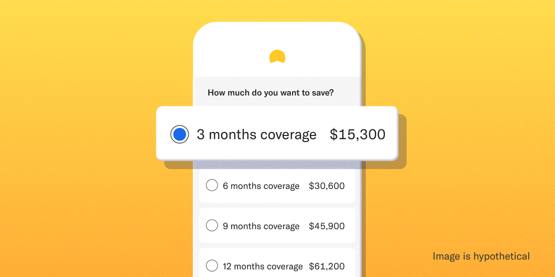
Investing
-
![]()
Betterment's asset allocation methodology
Betterment's asset allocation methodology Betterment helps you meet your goals by providing allocation advice. Our allocation methodology and the assumptions behind it are worth exploring. When you sign up with Betterment, you can set up investment goals you wish to save towards. You can set up countless investment goals. While creating a new investment goal, we will ask you for the anticipated time horizon of that goal, and to select one of the following goal types. Major Purchase Education Retirement Retirement Income General Investing Emergency Fund Betterment also allows users to create cash goals through the Cash Reserve offering, and crypto goals through the Crypto ETF portfolio. These goal types are outside the scope of this allocation advice methodology. Cash Reserve offered by Betterment LLC and requires a Betterment Securities brokerage account. Betterment is not a bank. FDIC insurance provided by Program Banks, subject to certain conditions. Learn more. For all investing goals (except for Emergency Funds) the anticipated time horizon and the goal type you select inform Betterment when you plan to use the money, and how you plan to withdraw the funds (i.e. full immediate liquidation for a major purchase, or partial periodic liquidations for retirement). Emergency Funds, by definition, do not have an anticipated time horizon (when you set up your goal, Betterment will assume a time horizon for Emergency Funds to help inform saving and deposit advice, but you can edit this, and it does not impact our recommended investment allocation). This is because we cannot predict when an unexpected emergency expense will arise, or how much it will cost. Betterment maintains a small operational cash allocation in automated investing portfolios in taxable accounts, health savings accounts, and individual retirement accounts. For more information, please refer to disclosures for your portfolio. For all goals (except for Emergency Funds) Betterment will recommend an investment allocation based on the time horizon and goal type you select. Betterment develops the recommended investment allocation by projecting a range of market outcomes and averaging the best-performing risk level across the 5th-50th percentiles. For Emergency Funds, Betterment’s recommended investment allocation provides growth potential while limiting the risk of a drawdown that doesn't surpass a recommended buffer above the amount needed in an emergency. Below are the ranges of recommended investment allocations for each goal type excluding Emergency Funds. Goal Type Most Aggressive Recommended Allocation Most Conservative Recommended Allocation Major Purchase 90% stocks (33+ years) 0% stocks (time horizon reached) Education 90% stocks (33+ years) 0% stocks (time horizon reached) Retirement 90% stocks (20+ years until retirement age) 56% stocks (retirement age reached) Retirement Income 56% stocks (24+ years remaining life expectancy) 30% stocks (9 years or less remaining life expectancy) General Investing 90% stocks (20+ years) 56% stocks (time horizon reached) As you can see from the table above, in general, the longer a goal’s time horizon, the more aggressive Betterment’s recommended allocation. And the shorter a goal’s time horizon, the more conservative Betterment’s recommended allocation. This results in what we call a “glidepath” which is how our recommended allocation for a given goal type adjusts over time. Below are the full glidepaths when applicable to the goal types Betterment offers. Major Purchase/Education Goals Retirement/Retirement Income Goals Figure above shows a hypothetical example of a client who lives until they’re 90 years old. It does not represent actual client performance and is not indicative of future results. Actual results may vary based on a variety of factors, including but not limited to client changes inside the account and market fluctuation. General Investing Goals Betterment offers an “auto-adjust” feature that will automatically adjust your goal’s allocation to control risk for applicable goal types, becoming more conservative as you near the end of your goals’ investing timeline. We make incremental changes to your risk level, creating a smooth glidepath. Since Betterment adjusts the recommended allocation and portfolio weights of the glidepath based on your specific goals and time horizons, you’ll notice that “Major Purchase” goals take a more conservative path compared to a Retirement or General Investing glidepath. It takes a near zero risk for very short time horizons because we expect you to fully liquidate your investment at the intended date. With Retirement goals, we expect you to take distributions over time so we will recommend remaining at a higher risk allocation even as you reach the target date. Auto-adjust is available in investing goals with an associated time horizon (excluding Emergency Fund goals, the Target Income built with BlackRock portfolio, and the Goldman Sachs Tax-Smart Bonds portfolio) for the Betterment Core portfolio, SRI portfolios, Innovation Technology portfolio, Value Tilt portfolio, and Goldman Sachs Smart Beta portfolio. If you would like Betterment to automatically adjust your investments according to these glidepaths, you have the option to enable Betterment’s auto-adjust feature when you accept Betterment’s recommended allocation. This feature uses reactive rebalancing and proactive rebalancing to help keep your goal’s allocation inline with our recommended allocation. Adjusting for Risk Tolerance The above investment allocation recommendations and glidepaths are based on what we call “risk capacity” or the extent to which a client’s goal can sustain a financial setback based on its anticipated time horizon and liquidation strategy. Clients have the option to agree with this recommendation or to deviate from it. Betterment uses an interactive slider that allows clients to toggle between different investment allocations (how much is allocated to stocks versus bonds) until they find the allocation that has the expected range of growth outcomes they are willing to experience for that goal given their tolerance for risk. Betterment’s slider contains 5 categories of risk tolerance: Very Conservative: This risk setting is associated with an allocation that is more than 7 percentage points below our recommended allocation to stocks. That’s ok, as long as you’re aware that you may sacrifice potential returns in order to limit your possibility of experiencing losses. You may need to save more in order to reach your goals. This setting is appropriate for those who have a lower tolerance for risk. Conservative: This risk setting is associated with an allocation that is between 4-7 percentage points below our recommended allocation to stocks. That’s ok, as long as you’re aware that you may sacrifice potential returns in order to limit your possibility of experiencing losses. You may need to save more in order to reach your goals. This setting is appropriate for those who have a lower tolerance for risk. Moderate: This risk setting is associated with an allocation that is within 3 percentage points of our recommended allocation to stocks. Aggressive: This risk setting is associated with an allocation that is between 4-7 percentage points above our recommended allocation to stocks. This gives the benefit of potentially higher returns in the long-term but exposes you to higher potential losses in the short-term. This setting is appropriate for those who have a higher tolerance for risk. Very Aggressive: This risk setting is associated with an allocation that is more than 7 percentage points above our recommended allocation to stocks. This gives the benefit of potentially higher returns in the long-term but exposes you to higher potential losses in the short-term. This setting is appropriate for those who have a higher tolerance for risk. -
![]()
How Betterment manages risks in your portfolio
How Betterment manages risks in your portfolio Betterment’s tools can keep you on track with the best chance of reaching your goals. Investing always involves some level of risk. But you should always have control over how much risk you take on. When your goals are decades away, it's easier to invest in riskier assets. The closer you get to reaching your goals, the more you may want to play it safe. Betterment’s tools can help manage risk and keep you on track toward your goals. In this guide, we’ll: Explain how Betterment provides allocation advice Talk about determining your personal risk level Walk through some of Betterment’s automated tools that help you manage risk Take a look at low-risk portfolios The key to managing your risk: asset allocation Risk is inherent to investing, and to some degree risk is good. High risk, high reward, right? What’s important is how you manage your risk. You want your investments to grow as the market fluctuates. One major way investors manage risk is through diversification. You’ve likely heard the old cliche, “Don’t put all your eggs in one basket.” This is the same reasoning investors use. We diversify our investments, putting our eggs in various baskets, so to speak. This way if one investment fails, we don’t lose everything. But how do you choose which baskets to put your eggs in? And how many eggs do you put in those baskets? Investors have a name for this process: asset allocation. Asset allocation involves splitting up your investment dollars across several types of financial assets (like stocks and bonds). Together these investments form your portfolio. A good portfolio will have your investment dollars in the right baskets: protecting you from extreme loss when the markets perform poorly, yet leaving you open to windfalls when the market does well. If that sounds complicated, there’s good news: Betterment will automatically recommend how to allocate your investments based on your individual goals. How Betterment provides allocation advice At Betterment, our recommendations start with your financial goals. Each of your financial goals—whether it’s a vacation or retirement—gets its own allocation primarily of stocks and bonds. Next we look at your investment horizon, a fancy term for “when you need the money and how you’ll withdraw it.” It’s like a timeline. How long will you invest for? Will you take it out all at once, or a little bit at a time? For a down payment goal, you might withdraw the entire investment after 10 years once you’ve hit your savings mark. But when you retire, you’ll probably withdraw from your retirement account gradually over the course of years. What if you don’t have a defined goal? If you’re investing without a timeline or target amount, we’ll use your age to set your investment horizon with a default target date of your 65th birthday. We’ll assume you’ll withdraw from it like a retirement account, but maintain a slightly riskier portfolio even when you hit the target date, since you haven’t decided when you'll liquidate those investments. But you’re not a “default” person. So why would you want a default investment plan? That’s why you should have a goal. When we know your goal and time horizon, we can determine the best risk level by assessing possible outcomes across a range of bad to average markets. Our projection model includes many possible futures, weighted by how likely we believe each to be. By some standards, we err on the side of caution with a fairly conservative allocation model. Our mission is to help you get to your goal through steady saving and appropriate allocation, rather than taking on unnecessary risk. How much risk should you take on? Your investment horizon is one of the most important factors in determining your risk level. The more time you have to reach your investing goals, the more risk you can afford to safely take. So generally speaking, the closer you are to reaching your goal, the less risk your portfolio should be exposed to. This is why we use the Betterment auto-adjust—a glide path (aka formula) used for asset allocation that becomes more conservative as your target date approaches. We adjust the recommended allocation and portfolio weights of the glide path based on your specific goal and time horizon. Want to take a more aggressive approach? More conservative? That’s totally ok. You’re in control. You always have the final say on your allocation, and we can show you the likely outcomes. Our quantitative approach helps us establish a set of recommended risk ranges based on your goals. If you choose to deviate from our risk guidance, we’ll provide you with feedback on the potential implications. Take more risk than we recommend, and we’ll tell you we believe your approach is “too aggressive” given your goal and time horizon. Even if you care about the downsides less than the average outcome, we’ll still caution you against taking on more risk, because it can be very difficult to recover from losses in a portfolio flagged as “too aggressive.” On the other hand, if you choose a lower risk level than our “conservative” band, we'll label your choice “very conservative.” A downside to taking a lower risk level is you may need to save more. You should choose a level of risk that’s aligned with your ability to stay the course. An allocation is only optimal if you’re able to commit to it in both good markets and bad ones. To ensure you’re comfortable with the short-term risk in your portfolio, we present both extremely good and extremely poor return scenarios for your selection over a one-year period. How Betterment automatically optimizes your risk An advantage of investing with Betterment is that our technology works behind the scenes to automatically manage your risk in a variety of ways, including auto-adjusted allocation and rebalancing. Auto-adjusted allocation For most goals, the ideal allocation will change as you near your goal. Our automated tools aim to make those adjustments as efficient and tax-friendly as possible. Deposits, withdrawals, and dividends can help us guide your portfolio toward the target allocation. And when selling any of your investments, our tax-smart technology is designed to minimize the potential tax impact. First we look for shares that have losses. These can offset other taxes. Then we sell shares with the smallest embedded gains (and smallest potential taxes). Rebalancing Over time, individual assets in a diversified portfolio move up and down in value, drifting away from the target weights that help achieve proper diversification. The difference between your target allocation and the actual weights in your current ETF portfolio is called portfolio drift. We define portfolio drift as the total absolute deviation of each super asset class from its target, divided by two. These super asset classes are US Bonds, International Bonds, Emerging Markets Bonds, US Stocks, International Stocks, and Emerging Markets Stocks. For Betterment-constructed portfolios that include a cash allocation, drift in the cash allocation is measured alongside super asset class drift. (Separately, Betterment-managed custom portfolios evaluate drift at the security group level. For reference, security groups are groupings of tickers that include a primary ticker, and may include secondary and/or tertiary tickers designed to help avoid wash sales and allow for tax-loss harvesting opportunities). A high drift may expose you to more (or less) risk than you intended when you set the target allocation. Betterment automatically monitors your account for rebalancing opportunities to reduce drift. There are several different methods depending on the circumstances: First, in response to cash flows such as deposits, withdrawals, and dividend reinvestments, Betterment buys underweight holdings and sells overweight holdings. This reactive rebalancing generally occurs when cash flows going into or out of the portfolio are already happening. We use inflows (like deposits and dividend reinvestments) to buy asset classes that are under-weight. This reduces the need to sell, which in turn reduces potential capital gains taxes. And we use outflows (like withdrawals) by seeking to first sell asset classes that are overweight. Second, if cash flows are not sufficient to keep a client’s portfolio drift within its applicable drift tolerance (such parameters as disclosed in Betterment’s Form ADV), automated rebalancing sells overweight holdings in order to buy underweight ones, aligning the portfolio more closely with its target allocation. This proactive rebalancing reshuffles assets that are already in the portfolio, and requires a minimum portfolio balance (clients can review the estimated balance at www.betterment.com/legal/portfolio-minimum). The rebalancing algorithm is also calibrated to avoid frequent small rebalance transactions and to seek tax efficient outcomes, such as helping to reduce wash sales and minimizing short-term capital gains. Allocation change rebalancing occurs when you change your target allocation. This sells securities and could possibly realize capital gains, but we still utilize our tax minimization algorithm to help reduce the tax impact. We’ll let you know the potential tax impact before you confirm your allocation change. Once you confirm it, we’ll rebalance to your new target with minimized drift. When Betterment rebalances a portfolio with a cash allocation, the rebalancing algorithm will first seek to bring the portfolio's cash allocation back to its target before investing in securities. If cash is below its target allocation, rebalancing will first use available funds (e.g., deposits, dividends, and/or proceeds from selling overweight holdings) to increase cash up to target, and only any remaining available cash is invested in securities; conversely, if cash is above its target allocation, the excess cash above target will be invested in securities as a part of the rebalancing transaction. If you are an Advised client, rebalancing in your account may function differently depending on the customizations your Advisor has selected for your portfolio. We recommend reaching out to your Advisor for further details. For more information, please review our rebalancing disclosures. How Betterment reduces risk in portfolios Investments like short-term US treasuries can help reduce risk in portfolios. At a certain point, however, including assets such as these in a portfolio no longer improves returns for the amount of risk taken. For Betterment, this point is our 60% stock portfolio. Portfolios with a stock allocation of 60% or more don’t incorporate these exposures. We include our U.S. Ultra-Short Income ETF and our U.S. Short-Term Treasury Bond ETF in the portfolio at stock allocations below 60% for both the IRA and taxable versions of the Betterment Core portfolio strategy. If your portfolio includes no stocks (meaning you allocated 100% of your portfolio’s investments to bonds), we can take the hint. You likely don’t want to worry about market volatility. So in that case, we recommend that you invest everything in these ETFs. At 0% stocks, a Betterment Core portfolio generally consists of 60% U.S. short-term treasury bonds, 20% U.S. short-term high quality bonds, and 20% inflation protected bonds.* Increase the stock allocation in your portfolio, and we’ll decrease the allocation to these exposures. Reach the 60% stock allocation threshold, and we’ll remove these funds from the recommended portfolio. At that allocation, they decrease expected returns given the desired risk of the overall portfolio. Short-term U.S. treasuries generally have lower volatility (any price swings are quite mild) and smaller drawdowns (shorter, less significant periods of loss). The same can be said for short-term high quality bonds, but they are slightly more volatile. It’s also worth noting that these asset classes don’t always go down at exactly the same time. By combining these asset classes, we’re able to produce a portfolio with a higher potential yield while maintaining relatively lower volatility. As with other assets, the returns for assets such as high quality bonds include both the possibility of price returns and income yield. Generally, price returns are expected to be minimal, with the primary form of returns coming from the income yield. The yields you receive from the ETFs in Betterment’s 0% stocks portfolio are the actual yields of the underlying assets after fees. Since we’re investing directly in funds that are paying prevailing market rates, you can feel confident that the yield you receive is fair and in line with prevailing rates. Work toward your financial goals without risking it all Choosing an investment portfolio is a personal decision, but it doesn’t have to be a difficult one. At Betterment, our goal is to help you feel confident that you’re always taking an appropriate amount of risk. We’ll help you select a portfolio with the risk level that’s right for you, and you can rest assured that our automated services are built to manage it efficiently. *Target investments, actual holdings will vary. -
![]()
Betterment's asset location methodology
Betterment's asset location methodology Intelligently applying asset location to a globally diversified portfolio is a complex, mathematically rigorous, and continuous undertaking. TABLE OF CONTENTS Summary Part I: Introduction to Asset Location Part II: After-Tax Return—Deep Dive Part III: Asset Location Myths Part IV: TCP Methodology Part V: Monte Carlo on the Amazon—Betterment’s Testing Framework Part VI: Results Part VII: Special Considerations Addendum Summary Asset location is widely regarded as the closest thing there is to a "free lunch" in the wealth management industry.1 When investments are held in at least two types of accounts (out of three possible types: taxable, tax-deferred and tax-exempt), asset location provides the ability to deliver additional after-tax return potential, while maintaining the same level of risk. Generally speaking, this benefit is achieved by placing the least tax-efficient assets in the accounts taxed most favorably, and the most tax-efficient assets in the accounts taxed least favorably, all while maintaining the desired asset allocation in the aggregate. Part I: Introduction to Asset Location Maximizing after-tax return on investments can be complex. Still, most investors know that contributing to tax-advantaged (or "qualified") accounts is a relatively straightforward way to pay less tax on their retirement savings. Millions of Americans wind up with some combination of IRAs and 401(k) accounts, both available in two types: traditional or Roth. Many will only save in a taxable account once they have maxed out their contribution limits for the qualified accounts. But while tax considerations are paramount when choosing which account to fund, less thought is given to the tax impact of which investments to then purchase across all accounts. The tax profiles of the three account types (taxable, traditional, and Roth) have implications for what to invest in, once the account has been funded. Choosing wisely can significantly improve the after-tax value of one’s savings, when more than one account is in the mix. Almost universally, such investors can benefit from a properly executed asset location strategy. The idea behind asset location is fairly straightforward. Certain investments generate their returns in a more tax-efficient manner than others. Certain accounts shelter investment returns from tax better than others. Placing, or "locating" less tax-efficient investments in tax-sheltered accounts could increase the after-tax value of the overall portfolio. Allocate First, Locate Second Let’s start with what asset location isn’t. All investors must select a mix of stocks and bonds, finding an appropriate balance of risk and expected potential return, in line with their goals. One common goal is retirement, in which case, the mix of assets should be tailored to match the investor’s time horizon. This initial determination is known as "asset allocation," and it comes first. When investing in multiple accounts, it is common for investors to simply recreate their desired asset allocation in each account. If each account, no matter the size, holds the same assets in the same proportions, adding up all the holdings will also match the desired asset allocation. If all these funds, however scattered, are invested towards the same goal, this is the right result. The aggregate portfolio is the one that matters, and it should track the asset allocation selected for the common goal. Portfolio Managed Separately in Each Account Enter asset location, which can only be applied once a desired asset allocation is selected. Each asset’s after-tax return is considered in the context of every available account. The assets are then arranged (unequally) across all coordinated accounts to help maximize the after-tax performance of the overall portfolio. Same Portfolio Overall—With Asset Location To help conceptualize asset location, consider a team of runners. Some runners compete better on a track than a cross-country dirt path, as compared to their more versatile teammates. Similarly, certain asset classes can benefit more than others from the tax-efficient "terrain" of a qualified account. Asset allocation determines the composition of the team, and the overall portfolio’s after-tax return is a team effort. Asset location then seeks to match up asset and environment in a way that maximizes the overall result over time, while keeping the composition of the team intact. TCP vs. TDF The primary appeal of a target-date fund (TDF) is the "set it and forget it" simplicity with which it allows investors to select and maintain a diversified asset allocation, by purchasing only one fund. That simplicity comes at a price—because each TDF is a single, indivisible security, it cannot unevenly distribute its underlying assets across multiple accounts, and thus cannot deliver the additional after-tax returns of asset location. In particular, participants who are locked into 401(k) plans without automated management may find that a cheap TDF is still their best "hands off" option (plus, a TDF’s ability to satisfy the Qualified Default Investment Alternative (QDIA) requirement under ERISA ensures its baseline survival under current law). Participants in a Betterment at Work plan can already enable Betterment’s Tax-Coordinated Portfolio feature (“TCP”) to manage a single portfolio across their 401(k), IRAs and taxable accounts they individually have with Betterment, designed to squeeze additional after-tax returns from their aggregate long-term savings. Automated asset location (when integrated with automated asset allocation) replicates what makes a TDF so appealing, but effectively amounts to a "TDF 2.0"—a continuously managed portfolio, but one that can straddle multiple accounts for tax benefits. Next, we dive into the complex dynamics that need to be considered when seeking to optimize the after-tax return of a diversified portfolio. Part II: After-Tax Return—Deep Dive A good starting point for a discussion of investment taxation is the concept of "tax drag." Tax drag is the portion of the return that is lost to tax on an annual basis. In particular, funds pay dividends, which are taxed in the year they are received. However, there is no annual tax in qualified accounts, also sometimes known as "tax-sheltered accounts." Therefore, placing assets that pay a substantial amount of dividends into a qualified account, rather than a taxable account, "shelters" those dividends, and reduces tax drag. Reducing the tax drag of the overall portfolio is one way that asset location improves the portfolio’s potential after-tax return. Importantly, investments are also subject to tax at liquidation, both in the taxable account, and in a traditional IRA (where tax is deferred). However, "tax drag", as that term is commonly used, does not include liquidation tax. So while the concept of "tax drag" is intuitive, and thus a good place to start, it cannot be the sole focus when looking to help minimize taxes. What is "Tax Efficiency" A closely related term is "tax efficiency" and this is one that most discussions of asset location will inevitably focus on. A tax-efficient asset is one that has minimal "tax drag." Prioritizing assets on the basis of tax efficiency allows for asset location decisions to be made following a simple, rule-based approach. Both "tax drag" and "tax efficiency" are concepts pertaining to taxation of returns in a taxable account. Therefore, we first consider that account, where the rules are most elaborate. With an understanding of these rules, we can layer on the impact of the two types of qualified accounts. Returns in a Taxable Account There are two types of investment income, and two types of applicable tax rates. Two types of investment tax rates. All investment income in a taxable brokerage account is subject to one of two rate categories (with material exceptions noted). For simplicity, and to keep the analysis universal, this section only addresses federal tax (state tax is considered when testing for performance). Ordinary rate: For most, this rate mirrors the marginal tax bracket applicable to earned income (primarily wages reported on a W-2). Preferential rate: This more favorable rate ranges from 15% to 20% for most investors. For especially high earners, both rates are subject to an additional tax of 3.8%. Two types of investment returns. Investments generate returns in two ways: by appreciating in value, and by making cash distributions. Capital gains: When an investment is sold, the difference between the proceeds and the tax basis (generally, the purchase price) is taxed as capital gains. If held for longer than a year, this gain is treated as long-term capital gains (LTCG) and taxed at the preferential rate. If held for a year or less, the gain is treated as short-term capital gains (STCG), and taxed at the ordinary rate. Barring unforeseen circumstances, passive investors should be able to avoid STCG entirely. Betterment’s automated account management seeks to avoid STCG when possible,4 and the rest of this paper assumes only LTCG on liquidation of assets. Dividends: Bonds pay interest, which is taxed at the ordinary rate, whereas stocks pay dividends, which are taxed at the preferential rate (both subject to the exceptions below). An exchange-traded fund (ETF) pools the cash generated by its underlying investments, and makes payments that are called dividends, even if some or all of the source was interest. These dividends inherit the tax treatment of the source payments. This means that, generally, a dividend paid by a bond ETF is taxed at the ordinary rate, and a dividend paid by a stock ETF is taxed at the preferential rate. Qualified Dividend Income (QDI): There is an exception to the general rule for stock dividends. Stock dividends enjoy preferential rates only if they meet the requirements of qualified dividend income (QDI). Key among those requirements is that the company issuing the dividend must be a U.S. corporation (or a qualified foreign corporation). A fund pools dividends from many companies, only some of which may qualify for QDI. To account for this, the fund assigns itself a QDI percentage each year, which the custodian uses to determine the portion of the fund’s dividends that are eligible for the preferential rate. For stock funds tracking a U.S. index, the QDI percentage is typically 100%. However, funds tracking a foreign stock index will have a lower QDI percentage, sometimes substantially. For example, VWO, Vanguard’s Emerging Markets Stock ETF, had a QDI percentage of 38% in 2015, which means that 38% of its dividends for the year were taxed at the preferential rate, and 62% were taxed at the ordinary rate. Tax-exempt interest: There is also an exception to the general rule for bonds. Certain bonds pay interest that is exempt from federal tax. Primarily, these are municipal bonds, issued by state and local governments. This means that an ETF which holds municipal bonds will pay a dividend that is subject to 0% federal tax—even better than the preferential rate. The table below summarizes these interactions. Note that this section does not consider tax treatment for those in a marginal tax bracket of 15% and below. These taxpayers are addressed in "Special Considerations." Dividends (taxed annually) Capital Gains (taxed when sold) Ordinary Rate Most bonds Non-QDI stocks (foreign) Any security held for a year or less (STCG) Preferential Rate QDI stocks (domestic and some foreign) Any security held for more than a year (LTCG) No Tax Municipal bonds Any security transferred upon death or donated to charity The impact of rates is obvious: The higher the rate, the higher the tax drag. Equally important is timing. The key difference between dividends and capital gains is that the former are taxed annually, contributing to tax drag, whereas tax on the latter is deferred. Tax deferral is a powerful driver of after-tax return, for the simple reason that the savings, though temporary, can be reinvested in the meantime, and compounded. The longer the deferral, the more valuable it is. Putting this all together, we arrive at the foundational piece of conventional wisdom, where the most basic approach to asset location begins and ends: Bond funds are expected to generate their return entirely through dividends, taxed at the ordinary rate. This return benefits neither from the preferential rate, nor from tax deferral, making bonds the classic tax-inefficient asset class. These go in your qualified account. Stock funds are expected to generate their return primarily through capital gains. This return benefits both from the preferential rate, and from tax deferral. Stocks are therefore the more tax-efficient asset class. These go in your taxable account. Tax-Efficient Status: It’s Complicated Reality gets messy rather quickly, however. Over the long term, stocks are expected to grow faster than bonds, causing the portfolio to drift from the desired asset allocation. Rebalancing may periodically realize some capital gains, so we cannot expect full tax deferral on these returns (although if cash flows exist, investing them intelligently can potentially reduce the need to rebalance via selling). Furthermore, stocks do generate some return via dividends. The expected dividend yield varies with more granularity. Small cap stocks pay relatively little (these are growth companies that tend to reinvest any profits back into the business) whereas large cap stocks pay more (as these are mature companies that tend to distribute profits). Depending on the interest rate environment, stock dividends can exceed those paid by bonds. International stocks pay dividends too, and complicating things further, some of those dividends will not qualify as QDI, and will be taxed at the ordinary rate, like bond dividends (especially emerging markets stock dividends). Returns in a Tax-Deferred Account (TDA) Compared to a taxable account, a TDA is governed by straightforward rules. However, earning the same return in a TDA involves trade-offs which are not intuitive. Applying a different time horizon to the same asset can swing our preference between a taxable account and a TDA.Understanding these dynamics is crucial to appreciating why an optimal asset location methodology cannot ignore liquidation tax, time horizon, and the actual composition of each asset’s expected return.Although growth in a traditional IRA or traditional 401(k) is not taxed annually, it is subject to a liquidation tax. All the complexity of a taxable account described above is reduced to two rules. First, all tax is deferred until distributions are made from the account, which should begin only in retirement. Second, all distributions are taxed at the same rate, no matter the source of the return. The rate applied to all distributions is the higher ordinary rate, except that the additional 3.8% tax will not apply to those whose tax bracket in retirement would otherwise be high enough.2 First, we consider income that would be taxed annually at the ordinary rate (i.e. bond dividends and non-QDI stock dividends). The benefit of shifting these returns to a TDA is clear. In a TDA, these returns will eventually be taxed at the same rate, assuming the same tax bracket in retirement. But that tax will not be applied until the end, and compounding due to deferral can only have a positive impact on the after-tax return, as compared to the same income paid in a taxable account.3 In particular, the risk is that LTCG (which we expect plenty of from stock funds) will be taxed like ordinary income. Under the basic assumption that in a taxable account, capital gains tax is already deferred until liquidation, favoring a TDA for an asset whose only source of return is LTCG is plainly harmful. There is no benefit from deferral, which you would have gotten anyway, and only harm from a higher tax rate. This logic supports the conventional wisdom that stocks belong in the taxable account. First, as already discussed, stocks do generate some return via dividends, and that portion of the return will benefit from tax deferral. This is obviously true for non-QDI dividends, already taxed as ordinary income, but QDI can benefit too. If the deferral period is long enough, the value of compounding will offset the hit from the higher rate at liquidation. Second, it is not accurate to assume that all capital gains tax will be deferred until liquidation in a taxable account. Rebalancing may realize some capital gains "prematurely" and this portion of the return could also benefit from tax deferral. Placing stocks in a TDA is a trade-off—one that must weigh the potential harm from negative rate arbitrage against the benefit of tax deferral. Valuing the latter means making assumptions about dividend yield and turnover. On top of that, the longer the investment period, the more tax deferral is worth. Kitces demonstrates that a dividend yield representing 25% of total return (at 100% QDI), and an annual turnover of 10%, could swing the calculus in favor of holding the stocks in a TDA, assuming a 30-year horizon.4 For foreign stocks with less than perfect QDI, we would expect the tipping point to come sooner. Returns in a Tax-Exempt Account (TEA) Qualifying investments in a Roth IRA or Roth 401(k) grow tax free, and are also not taxed upon liquidation. Since it eliminates all possible tax, a TEA presents a particularly valuable opportunity for maximizing after-tax return. The trade-off here is managing opportunity cost—every asset does better in a TEA, so how best to use its precious capacity? Clearly, a TEA is the most favorably taxed account. Conventional wisdom thus suggests that if a TEA is available, we use it to first place the least tax-efficient assets. But that approach is wrong. Everything Counts in Large Amounts—Why Expected Return Matters The powerful yet simple advantage of a TEA helps illustrate the limitation of focusing exclusively on tax efficiency when making location choices. Returns in a TEA escape all tax, whatever the rate or timing would have been, which means that an asset’s expected after-tax return equals its expected total return. When both a taxable account and a TEA are available, it may be worth putting a high-growth, low-dividend stock fund into the TEA, instead of a bond fund, even though the stock fund is vastly more tax-efficient. Similar reasoning can apply to placement in a TDA as well, as long as the tax-efficient asset has a large enough expected return, and presents some opportunity for tax deferral (i.e., some portion of the return comes from dividends). Part III: Asset Location Myths Urban Legend 1: Asset location is a one-time process. Just set it and forget it. While an initial location may add some value, doing it properly is a continuous process, and will require adjustments in response to changing conditions. Note that overlaying asset location is not a deviation from a passive investing philosophy, because optimizing for location does not mean changing the overall asset allocation (the same goes for tax loss harvesting). Other things that will change, all of which should factor into an optimal methodology: expected returns (both the risk-free rate, and the excess return), dividend yields, QDI percentages, and most importantly, relative account balances. Contributions, rollovers, and conversions can increase qualified assets relative to taxable assets, continuously providing more room for additional optimization. Urban Legend 2: Taking advantage of asset location means you should contribute more to a particular qualified account than you otherwise would. Definitely not! Asset location should play no role in deciding which accounts to fund. It optimizes around account balances as it finds them, and is not concerned with which accounts should be funded in the first place. Just because the presence of a TEA makes asset location more valuable, does not mean you should contribute to a TEA, as opposed to a TDA. That decision is primarily a bet on how your tax rate today will compare to your tax rate in retirement. To hedge, some may find it optimal to make contributions to both a TDA and TEA (this is called "tax diversification"). While these decisions are out of scope for this paper, Betterment’s retirement planning tools can help clients with these choices. Urban Legend 3: Asset location has very little value if one of your accounts is relatively small. It depends. Asset location will not do much for investors with a very small taxable balance and a relatively large balance in only one type of qualified account, because most of the overall assets are already sheltered. However, a large taxable balance and a small qualified account balance (especially a TEA balance) presents a better opportunity. Under these circumstances, there may be room for only the least tax-efficient, highest-return assets in the qualified account. Sheltering a small portion of the overall portfolio can deliver a disproportionate amount of value. Urban Legend 4: Asset location has no value if you are investing in both types of qualified accounts, but not in a taxable account. A TEA offers significant advantages over a TDA. Zero tax is better than a tax deferred until liquidation. While tax efficiency (i.e. annual tax drag) plays no role in these location decisions, expected returns and liquidation tax do. The assets we expect to grow the most should be placed in a TEA, and doing so will plainly increase the overall after-tax return. There is an additional benefit as well. Required minimum distributions (RMDs) apply to TDAs but not TEAs. Shifting expected growth into the TEA, at the expense of the TDA, will mean lower RMDs, giving the investor more flexibility to control taxable income down the road. In other words, a lower balance in the TDA can mean lower tax rates in retirement, if higher RMDs would have pushed the retiree into a higher bracket. This potential benefit is not captured in our results. Urban Legend 5: Bonds always go in the IRA. Possibly, but not necessarily. This commonly asserted rule is a simplification, and will not be optimal under all circumstances. It is discussed at more length below. Existing Approaches to Asset Location: Advantages and Limitations Optimizing for After-Tax Return While Maintaining Separate Portfolios One approach to increasing after-tax return on retirement savings is to maintain a separate, standalone portfolio in each account with roughly the same level of risk-adjusted return, but tailoring each portfolio somewhat to take advantage of the tax profile of the account. Effectively, this means that each account separately maintains the desired exposure to stocks, while substituting certain asset classes for others. Generally speaking, managing a fully diversified portfolio in each account means that there is no way to avoid placing some assets with the highest expected return in the taxable account. This approach does include a valuable tactic, which is to differentiate the high-quality bonds component of the allocation, depending on the account they are held in. The allocation to the component is the same in each account, but in a taxable account, it is represented by municipal bonds which are exempt from federal tax , and in a qualified account, by taxable investment grade bonds . This variation is effective because it takes advantage of the fact that these two asset classes have very similar characteristics (expected returns, covariance and risk exposures) allowing them to play roughly the same role from an asset allocation perspective. Municipal bonds are highly tax-efficient due to their federal tax-exempt interest income, making them particularly compelling for a taxable account. Taxable investment grade bonds have significant tax drag, and work best in a qualified account. Betterment has applied this substitution since 2014. The Basic Priority List Gobind Daryanani and Chris Cordaro sought to balance considerations around tax efficiency and expected return, and illustrated that when both are very low, location decisions with respect to those assets have very limited impact.5 That study inspired Michael Kitces, who leverages its insights into a more sophisticated approach to building a priority list.6 To visually capture the relationship between the two considerations, Kitces bends the one-dimensional list into a "smile." Asset Location Priority List Assets with a high expected return that are also very tax-efficient go in the taxable account. Assets with a high expected return that are also very tax-inefficient go in the qualified accounts, starting with the TEA. The "smile" guides us in filling the accounts from both ends simultaneously, and by the time we get to the middle, whatever decisions we make with respect to those assets just "don’t matter" much. However, Kitces augments the graph in short order, recognizing that the basic "smile" does not capture a third key consideration—the impact of liquidation tax. Because capital gains will eventually be realized in a taxable account, but not in a TEA, even a highly tax-efficient asset might be better off in a TEA, if its expected return is high enough. The next iteration of the "smile" illustrates this preference. Asset Location Priority List with Limited High Return Inefficient Assets Part IV: TCP Methodology There is no one-size-fits-all asset location for every set of inputs. Some circumstances apply to all investors, but shift through time—the expected return of each asset class (which combines separate assumptions for the risk-free rate and the excess return), as well as dividend yields, QDI percentages, and tax laws. Other circumstances are personal—which accounts the client has, the relative balance of each account, and the client’s time horizon. Solving for multiple variables while respecting defined constraints is a problem that can be effectively solved by linear optimization. This method is used to maximize some value, which is represented by a formula called an "objective function." What we seek to maximize is the after-tax value of the overall portfolio at the end of the time horizon. We get this number by adding together the expected after-tax value of every asset in the portfolio, but because each asset can be held in more than one account, each portion must be considered separately, by applying the tax rules of that account. We must therefore derive an account-specific expected after-tax return for each asset. Deriving Account-Specific After-Tax Return To define the expected after-tax return of an asset, we first need its total return (i.e., before any tax is applied). The total return is the sum of the risk-free rate (same for every asset) and the excess return (unique to every asset). Betterment derives excess returns using the Black-Litterman model as a starting point. This common industry method involves analyzing the global portfolio of investable assets and their proportions, and using them to generate forward-looking expected returns for each asset class. Next, we must reduce each total return into an after-tax return.7 The immediate problem is that for each asset class, the after-tax return can be different, depending on the account, and for how long it is held. In a TEA, the answer is simple—the after-tax return equals the total return—no calculation necessary. In a TDA, we project growth of the asset by compounding the total return annually. At liquidation, we apply the ordinary rate to all of the growth.8 We use what is left of the growth after taxes to derive an annualized return, which is our after-tax return. In a taxable account, we need to consider the dividend and capital gain component of the total return separately, with respect to both rate and timing. We project growth of the asset by taxing the dividend component annually at the ordinary rate (or the preferential rate, to the extent that it qualifies as QDI) and adding back the after-tax dividend (i.e., we reinvest it). Capital gains are deferred, and the LTCG is fully taxed at the preferential rate at the end of the period. We then derive the annualized return based on the after-tax value of the asset.9 Note that for both the TDA and taxable calculations, time horizon matters. More time means more value from deferral, so the same total return can result in a higher annualized after-tax return. Additionally, the risk-free rate component of the total return will also depend on the time horizon, which affects all three accounts. Because we are accounting for the possibility of a TEA, as well, we actually have three distinct after-tax returns, and thus each asset effectively becomes three assets, for any given time horizon (which is specific to each Betterment customer). The Objective Function To see how this comes together, we first consider an extremely simplified example. Let’s assume we have a taxable account, both a traditional and Roth account, with $50,000 in each one, and a 30-year horizon. Our allocation calls for 70% equities (stocks), so with a total portfolio value of $150,000, we need $105,000 of stocks. 1. These are constants whose value we already know (as derived above). req,tax is the after-tax return of stocks in the taxable account, over 30 years req,trad is the after-tax return of stocks in the traditional account, over 30 years req,roth is the after-tax return of stocks in the Roth account, over 30 years rfi,tax is the after-tax return of bonds in the taxable account, over 30 years rfi,trad is the after-tax return of bonds in the traditional account, over 30 years rfi,roth is the after-tax return of bonds in the Roth account, over 30 years 2. These are the values we are trying to solve for (called "decision variables"). xeq,tax is the amount of stocks we will place in the taxable account xeq,trad is the amount of stocks we will place in the traditional account xeq,roth is the amount of stocks we will place in the Roth account xfi,tax is the amount of bonds we will place in the taxable account xfi,trad is the amount of bonds we will place in the traditional account xfi,roth is the amount of bonds we will place in the Roth account 3. These are the constraints which must be respected. All positions for each asset must add up to what we have allocated to the asset overall. All positions in each account must add up to the available balance in each account. xeq,tax + xeq,trad + xeq,roth = 105,000 xfi,tax + xfi,trad + xfi,roth = 45,000 xeq,tax + xfi,tax = 50,000 xeq,trad + xfi,trad = 50,000 xeq,roth + xfi,roth = 50,000 4. This is the objective function, which uses the constants and decision variables to express the after-tax value of the entire portfolio, represented by the sum of six terms (the after-tax value of each asset in each of the three accounts). maxx req,taxxeq,tax + req,tradxeq,trad + req,rothxeq,roth + rfi,taxxfi,tax + rfi,tradxfi,trad + rfi,rothxfi,roth Linear optimization turns all of the above into a complex geometric representation, and mathematically closes in on the optimal solution. It assigns values for all decision variables in a way that maximizes the value of the objective function, while respecting the constraints. Accordingly, each decision variable is a precise instruction for how much of which asset to put in each account. If a variable comes out as zero, then that particular account will contain none of that particular asset. An actual Betterment portfolio can potentially have twelve asset classes,15 depending on the allocation. That means TCP must effectively handle up to 36 "assets," each with its own after-tax return. However, the full complexity behind TCP goes well beyond increasing assets from two to twelve. Updated constants and constraints will trigger another part of the optimization, which determines what TCP is allowed to sell, in order to move an already coordinated portfolio toward the newly optimal asset location, while minimizing taxes. Reshuffling assets in a TDA or TEA is "free" in the sense that no capital gains will be realized.10 In the taxable account, however, TCP will attempt to move as close as possible towards the optimal asset location without realizing capital gains. Expected returns will periodically be updated, either because the risk-free rate has been adjusted, or because new excess returns have been derived via Black-Litterman. Future cash flows may be even more material. Additional funds in one or more of the accounts could significantly alter the constraints which define the size of each account, and the target dollar allocation to each asset class. Such events (including dividend payments, subject to a de minimis threshold) will trigger a recalculation, and potentially a reshuffling of the assets. Cash flows, in particular, can be a challenge for those managing their asset location manually. Inflows to just one account (or to multiple accounts in unequal proportions) create a tension between optimizing asset location and maintaining asset allocation, which is hard to resolve without mathematical precision. To maintain the overall asset allocation, each position in the portfolio must be increased pro-rata. However, some of the additional assets we need to buy "belong" in other accounts from an asset location perspective, even though new cash is not available in those accounts. If the taxable account can only be partially reshuffled due to built-in gains, we must choose either to move farther away from the target allocation, or the target location.11 With linear optimization, our preferences can be expressed through additional constraints, weaving these considerations into the overall problem. When solving for new cash flows, TCP penalizes allocation drift higher than it does location drift. Against this background, it is important to note that expected returns (the key input into TCP, and portfolio management generally) are educated guesses at best. No matter how airtight the math, reasonable people will disagree on the "correct" way to derive them, and the future may not cooperate, especially in the short-term. There is no guarantee that any particular asset location will add the most value, or even any value at all. But given decades, the likelihood of this outcome grows. For portfolios that include a cash allocation, Betterment locates the entire cash allocation in the taxable account within the Tax-Coordinated Portfolio first, consistent with our asset location approach of reserving tax-advantaged accounts for assets with higher expected returns. If the portfolio does not include a taxable account, cash will be located in a traditional IRA before a Roth IRA. Tax-Coordinated Portfolios that include a 401(k) will not include a cash allocation. Part V: Monte Carlo—Betterment’s Testing Framework To test the output of the linear optimization method, we turned to a Monte Carlo testing framework,12 built entirely in-house by Betterment’s experts. The forward-looking simulations model the behavior of the TCP strategy down to the individual lot level. We simulate the paths of these lots, accounting for dividend reinvestment, rebalancing, and taxation. The simulations applied Betterment’s rebalancing methodology, which corrects drift from the target asset allocation in excess of the applicable drift threshold once the account balances meet or exceed the required minimum, but stops short of realizing STCG, when possible. Betterment’s management fees were assessed in all accounts, and ongoing taxes were paid annually from the taxable account. All taxable sales first realized available losses before touching LTCG. The simulations assume no additional cash flows other than dividends. This is not because we do not expect them to happen. Rather, it is because making assumptions around these very personal circumstances does nothing to isolate the benefit of TCP specifically. Asset location is driven by the relative sizes of the accounts, and cash flows will change these ratios, but the timing and amount is highly specific to the individual.19 Avoiding the need to make specific assumptions here helps keep the analysis more universal. We used equal starting balances for the same reason.13 For every set of assumptions, we ran each market scenario while managing each account as a standalone (uncoordinated) Betterment portfolio as the benchmark.14 We then ran the same market scenarios with TCP enabled. In both cases, we calculated the after-tax value of the aggregate portfolio after full liquidation of invested assets at the end of the period.15 Then, for each market scenario, we calculated the after-tax annualized internal rates of return (IRR) and subtracted the benchmark IRR from the TCP IRR. That delta represents the incremental tax alpha of TCP for that scenario. The median of those deltas across all market scenarios is the estimated tax alpha we present below for each set of assumptions. Part VI: Results More Bonds, More Alpha A higher allocation to bonds leads to a dramatically higher benefit across the board. This makes sense—the heavier your allocation to tax-inefficient assets, the more asset location can do for you. To be extremely clear: this is not a reason to select a lower allocation to stocks! Over the long-term, we expect a higher stock allocation to return more (because it’s riskier), both before, and after tax. These are measurements of the additional return due to TCP, which say nothing about the absolute return of the asset allocation itself. Conversely, a very high allocation to stocks shows a smaller (though still real) benefit. However, younger customers invested this aggressively should gradually reduce risk as they get closer to retirement (to something more like 50% stocks). Looking to a 70% stock allocation is therefore an imperfect but reasonable way to generalize the value of the strategy over a 30-year period. More Roth, More Alpha Another pattern is that the presence of a Roth makes the strategy more valuable. This also makes sense—a taxable account and a TEA are on opposite ends of the "favorably taxed" spectrum, and having both presents the biggest opportunity for TCP’s "account arbitrage." But again, this benefit should not be interpreted as a reason to contribute to a TEA over a TDA, or to shift the balance between the two via a Roth conversion. These decisions are driven by other considerations. TCP’s job is to optimize the relative balances as it finds them. Enabling TCP On Existing Taxable Accounts TCP should be enabled before the taxable account is funded, meaning that the initial location can be optimized without the need to sell potentially appreciated assets. A Betterment customer with an existing taxable account who enables TCP should not expect the full incremental benefit, to the extent that assets with built-in capital gains need to be sold to achieve the optimal location. This is because TCP conservatively prioritizes avoiding a certain tax today, over potentially reducing tax in the future. However, the optimization is performed every time there is a deposit (or dividend) to any account. With future cash flows, the portfolio will move closer to whatever the optimal location is determined to be at the time of the deposit. Part VII: Special Considerations Low Bracket Taxpayers: Beware Taxation of investment income is substantially different for those who qualify for a marginal tax bracket of 15% or below. To illustrate, we have modified the chart from Part II to apply to such low bracket taxpayers. Dividends Capital Gains Ordinary Rate N/A Any security held for a year or less (STCG) Preferential Rate N/A N/A No Tax Qualified dividends from any security are not taxed Any security held for a year or more is not taxed (LTCG) TCP is not designed for these investors. Optimizing around this tax profile would reverse many assumptions behind TCP’s methodology. Municipal bonds no longer have an advantage over other bond funds. The arbitrage opportunity between the ordinary and preferential rate is gone. In fact, there’s barely tax of any kind. It is quite likely that such investors would not benefit much from TCP, and may even reduce their overall after-tax return. If the low tax bracket is temporary, TCP over the long-term may still make sense. Also note that some combinations of account balances can, in certain circumstances, still add tax alpha for investors in low tax brackets. One example is when an investor only has traditional and Roth IRA accounts, and no taxable accounts being tax coordinated. Low bracket investors should very carefully consider whether TCP is suitable for them. As a general rule, we do not recommend it. Potential Problems with Coordinating Accounts Meant for Different Time Horizons We began with the premise that asset location is sensible only with respect to accounts that are generally intended for the same purpose. This is crucial, because unevenly distributing assets will result in asset allocations in each account that are not tailored towards the overall goal (or any goal at all). This is fine, as long as we expect that all coordinated accounts will be available for withdrawals at roughly the same time (e.g. at retirement). Only the aggregate portfolio matters in getting there. However, uneven distributions are less diversified. Temporary drawdowns (e.g., the 2008 financial crisis) can mean that a single account may drop substantially more than the overall coordinated portfolio. If that account is intended for a short-term goal, it may not have a chance to recover by the time you need the money. Likewise, if you do not plan on depleting an account during your retirement, and instead plan on leaving it to be inherited for future generations, arguably this account has a longer time horizon than the others and should thus be invested more aggressively. In either case, we do not recommend managing accounts with materially different time horizons as a single portfolio. For a similar reason, you should avoid applying asset location to an account that you expect will be long-term, but one that you may look to for emergency withdrawals. For example, a Safety Net Goal should never be managed by TCP. Large Upcoming Transfers/Withdrawals If you know you will be making large transfers in or out of your tax-coordinated accounts, you may want to delay enabling our tax coordination tool until after those transfers have occurred. This is because large changes in the balances of the underlying accounts can necessitate rebalancing, and thus may cause taxes. With incoming deposits, we can intelligently rebalance your accounts by increasing the allocation of asset classes that are underweight. But when large withdrawals or transfers out are made, despite Betterment’s intelligent management of executing trades, some taxes can be unavoidable when rebalancing to your overall target allocation. The only exception to this rule is if the large deposit will be in your taxable account instead of your IRAs. In that case, you should enable tax-coordination before depositing money into the taxable account. This is so our system knows to tax-coordinate you immediately. The goal of tax coordination is to reduce the drag taxes have on your investments, not cause additional taxes. So if you know an upcoming withdrawal or outbound transfer could cause rebalancing, and thus taxes, it would be prudent to delay enabling tax coordination until you have completed those transfers. Mitigating Behavioral Challenges Through Design There is a broader issue that stems from locating assets with different volatility profiles at the account level, but it is behavioral. Uncoordinated portfolios with the same allocation move together. Asset location, on the other hand, will cause one account to dip more than another, testing an investor’s stomach for volatility. Those who enable TCP across their accounts should be prepared for such differentiated movements. Rationally, we should ignore this—after all, the overall allocation is the same—but that is easier said than done. How TCP Interacts with Tax Loss Harvesting TCP and TLH work in tandem, seeking to minimize tax impact. As described in more detail below, the precise interaction between the two strategies is highly dependent on personal circumstances. While it is possible that enabling a TCP may reduce harvest opportunities, both TLH and TCP derive their benefit without disturbing the desired asset allocation. Operational Interaction TLH was designed around a "tertiary ticker" system, which ensures that no purchase in an IRA or 401(k) managed by Betterment will interfere with a harvested loss in a Betterment taxable account. A sale in a taxable account, and a subsequent repurchase of the same asset class in a qualified account would be incidental for accounts managed as separate portfolios. Under TCP, however, we expect this to occasionally happen by design. When "relocating" assets, either during initial setup, or as part of ongoing optimization, TCP will sell an asset class in one account, and immediately repurchase it in another. The tertiary ticker system allows this reshuffling to happen seamlessly, while attempting to protect any tax losses that are realized in the process. Conceptualizing Blended Performance TCP will affect the composition of the taxable account in ways that are hard to predict, because its decisions will be driven by changes in relative balances among the accounts. Meanwhile, the weight of specific asset classes in the taxable account is a material predictor of the potential value of TLH (more volatile assets should offer more harvesting opportunities). The precise interaction between the two strategies is far more dependent on personal circumstances, such as today’s account balance ratios and future cash flow patterns, than on generally applicable inputs like asset class return profiles and tax rules. These dynamics are best understood as a hierarchy. Asset allocation comes first, and determines what mix of asset classes we should stick to overall. Asset location comes second, and continuously generates tax alpha across all coordinated accounts, within the constraints of the overall portfolio. Tax loss harvesting comes third, and looks for opportunities to generate tax alpha from the taxable account only, within the constraints of the asset mix dictated by asset location for that account. TLH is usually most effective in the first several years after an initial deposit to a taxable account. Over decades, however, we expect it to generate value only from subsequent deposits and dividend reinvestments. Eventually, even a substantial dip is unlikely to bring the market price below the purchase price of the older tax lots. Meanwhile, TCP aims to deliver tax alpha over the entire balance of all three accounts for the entire holding period. *** Betterment does not represent in any manner that TCP will result in any particular tax consequence or that specific benefits will be obtained for any individual investor. The TCP service is not intended as tax advice. Please consult your personal tax advisor with any questions as to whether TCP is a suitable strategy for you in light of your individual tax circumstances. Please see our Tax-Coordinated Portfolio Disclosures for more information. Addendum As of May 2020, for customers who indicate that they’re planning on using a Health Savings Account (HSA) for long-term savings, we allow the inclusion of their HSA in their Tax-Coordinated Portfolio. If an HSA is included in a Tax-Coordinated Portfolio, we treat it essentially the same as an additional Roth account. This is because funds within an HSA grow income tax-free, and withdrawals can be made income tax-free for medical purposes. With this assumption, we also implicitly assume that the HSA will be fully used to cover long-term medical care spending. The tax alpha numbers presented above have not been updated to reflect the inclusion of HSAs, but remain our best-effort point-in-time estimate of the value of TCP at the launch of the feature. As the inclusion of HSAs allows even further tax-advantaged contributions, we contend that the inclusion of HSAs is most likely to additionally benefit customers who enable TCP. 1"Boost Your After-Tax Investment Returns." Susan B. Garland. Kiplinger.com, April 2014. 2But see "How IRA Withdrawals In The Crossover Zone Can Trigger The 3.8% Medicare Surtax," Michael Kitces, July 23, 2014. 3It is worth emphasizing that asset location optimizes around account balances as it finds them, and has nothing to say about which account to fund in the first place. Asset location considers which account is best for holding a specified dollar amount of a particular asset. However, contributions to a TDA are tax-deductible, whereas getting a dollar into a taxable account requires more than a dollar of income. 4Pg. 5, The Kitces Report. January/February 2014. 5Daryanani, Gobind, and Chris Cordaro. 2005. "Asset Location: A Generic Framework for Maximizing After-Tax Wealth." Journal of Financial Planning (18) 1: 44–54. 6The Kitces Report, March/April 2014. 7While the significance of ordinary versus preferential tax treatment of income has been made clear, the impact of an individual’s specific tax bracket has not yet been addressed. Does it matter which ordinary rate, and which preferential rate is applicable, when locating assets? After all, calculating the after-tax return of each asset means applying a specific rate. It is certainly true that different rates should result in different after-tax returns. However, we found that while the specific rate used to derive the after-tax return can and does affect the level of resulting returns for different asset classes, it makes a negligible difference on resulting location decisions. The one exception is when considering using very low rates as inputs (the implication of which is discussed under "Special Considerations"). This should feel intuitive: Because the optimization is driven primarily by the relative size of the after-tax returns of different asset classes, moving between brackets moves all rates in the same direction, generally maintaining these relationships monotonically. The specific rates do matter a lot when it comes to estimating the benefit of the asset location chosen, so rate assumptions are laid out in the "Results" section. In other words, if one taxpayer is in a moderate tax bracket, and another in a high bracket, their optimal asset location will be very similar and often identical, but the high bracket investor may benefit more from the same location. 8In reality, the ordinary rate is applied to the entire value of the TDA, both the principal (i.e., the deductible contributions) and the growth. However, this will happen to the principal whether we use asset location or not. Therefore, we are measuring here only that which we can optimize. 9TCP today does not account for the potential benefit of a foreign tax credit (FTC). The FTC is intended to mitigate the potential for double taxation with respect to income that has already been taxed in a foreign country. The scope of the benefit is hard to quantify and its applicability depends on personal circumstances. All else being equal, we would expect that incorporating the FTC may somewhat increase the after-tax return of certain asset classes in a taxable account—in particular developed and emerging markets stocks. If maximizing your available FTC is important to your tax planning, you should carefully consider whether TCP is the optimal strategy for you. 10Standard market bid-ask spread costs will still apply. These are relatively low, as Betterment considers liquidity as a factor in its investment selection process. Betterment customers do not pay for trades. 11Additionally, in the interest of making interaction with the tool maximally responsive, certain computationally demanding aspects of the methodology were simplified for purposes of the tool only. This could result in a deviation from the target asset location imposed by the TCP service in an actual Betterment account. 12Another way to test performance is with a backtest on actual market data. One advantage of this approach is that it tests the strategy on what actually happened. Conversely, a forward projection allows us to test thousands of scenarios instead of one, and the future is unlikely to look like the past. Another limitation of a backtest in this context—sufficiently granular data for the entire Betterment portfolio is only available for the last 15 years. Because asset location is fundamentally a long-term strategy, we felt it was important to test it over 30 years, which was only possible with Monte Carlo. Additionally, Monte Carlo actually allows us to test tweaks to the algorithm with some confidence, whereas adjusting the algorithm based on how it would have performed in the past is effectively a type of "data snooping". 13That said, the strategy is expected to change the relative balances dramatically over the course of the period, due to unequal allocations. We expect a Roth balance in particular to eventually outpace the others, since the optimization will favor assets with the highest expected return for the TEA. This is exactly what we want to happen. 14For the uncoordinated taxable portfolio, we assume an allocation to municipal bonds (MUB) for the high-quality bonds component, but use investment grade taxable bonds (AGG) in the uncoordinated portfolio for the qualified accounts. While TCP makes use of this substitution, Betterment has offered it since 2014, and we want to isolate the additional tax alpha of TCP specifically, without conflating the benefits. 15Full liquidation of a taxable or TDA portfolio that has been growing for 30 years will realize income that is guaranteed to push the taxpayer into a higher tax bracket. We assume this does not happen, because in reality, a taxpayer in retirement will make withdrawals gradually. The strategies around timing and sequencing decumulation from multiple account types in a tax-efficient manner are out of scope for this paper. Additional References Berkin. A. "A Scenario Based Approach to After-Tax Asset Allocation." 2013. Journal of Financial Planning. Jaconetti, Colleen M., CPA, CFP®. Asset Location for Taxable Investors, 2007. https://personal.vanguard.com/pdf/s556.pdf. Poterba, James, John Shoven, and Clemens Sialm. "Asset Location for Retirement Savers." November 2000. https://faculty.mccombs.utexas.edu/Clemens.Sialm/PSSChap10.pdf. Reed, Chris. "Rethinking Asset Location - Between Tax-Deferred, Tax-Exempt and Taxable Accounts." Accessed 2015. https://papers.ssrn.com/sol3/papers.cfm?abstract_id=2317970. Reichenstein, William, and William Meyer. "The Asset Location Decision Revisited." 2013. Journal of Financial Planning 26 (11): 48–55. Reichenstein, William. 2007. "Calculating After-Tax Asset Allocation is Key to Determining Risk, Returns, and Asset Location." Journal of Financial Planning (20) 7: 44–53.

Planning
-
![]()
Debt doesn't have to keep you caged—here's how to save your way out
Debt doesn't have to keep you caged—here's how to save your way out Paying down debt and building your savings aren't mutually exclusive—here's a simple framework for juggling both at once. Key takeaways Getting your financial footing early in your career has never been easy, but today’s high-debt, low-hire job economy adds to the struggles. But you don't need to be debt-free before you start saving. They can run on parallel tracks. Some debt can sit on the backburner while you put your money to work elsewhere. It all hinges on how high of an interest rate a loan carries. Quick number crunching beats a high-maintenance budget. Size up your cash flow, then direct your discretionary spending with a few guiding principles. Between college, cars, and credit cards, debt is a simple fact of life for a lot of us, especially those early in their careers. But waiting until you’re debt-free to start saving means missing out on one of your biggest advantages as a saver: time. So let’s reset expectations. With a clearer picture of your cash flow, you can chip away at debt, find your financial footing, and start enjoying some meaningful financial freedoms all at the same time First: Figure out what you're working with Do you really need a budget? We’d say yes, but it doesn’t need to be a detailed spreadsheet or elaborate app. Crunch a few numbers, then get on with it. Because before you can decide where your money goes, you need to know how much you have to direct in the first place. Start with your take-home pay, what lands in your account after taxes. Then subtract bare necessities like: Housing — your total costs will vary depending on whether you rent or own Utilities — electricity, internet, phone, etc. Transportation — car payment, insurance, gas, or transit Groceries — actual at-home food spending, not delivery Health insurance — assuming you're not on a parent's plan What's left is your discretionary income. For a lot of people in their 20s, that number is smaller than they'd like. That's okay. Even a little is enough to get started. From there, split what's left into two buckets: Freedom fund — for saving, debt paydown, and building toward bigger goals (more on this below) Fun fund — for shame-free spending like going out, trips, whatever makes your life feel like your life If you have a decent chunk of discretionary spending to work with, a 50/50 split between these two buckets is a solid starting point. If things are tight, lean toward the freedom fund for now. This is your money's first real job—not just covering expenses, but starting to build something. Then: Build your freedom fund Financial freedom comes in many shapes and sizes, but the most impactful aren't always the most exciting. So when setting up your freedom fund, it’s often best to focus first on preventing backsliding. 1. Cover your minimum payments and capture any employer match Missing minimum debt payments can lead to late fees, credit score dings, and balances that quickly balloon—small problems that become expensive ones quickly. If your employer offers a 401(k) match, contribute enough to get it. That match is treated as part of your total compensation. Leaving it on the table is like giving yourself a pay cut. 2. Attack high-interest debt while building a starter emergency fund Not all debts are created equal. Those with higher interest rates—roughly 8% or higher based on the current rate environment and market forecasts—can snowball fast. So paying them down aggressively is often the higher-ROI move. Lower-interest debt, on the other hand, is less of an emergency. You don't need to pour every available dollar into paying it off. Steady, on-time payments can be enough while you work toward other goals. At the same time, consider building a small cash cushion as you go. Without one, a single surprise bill can send you right back to square one. Even $500 in a high-yield cash account makes a meaningful difference. Cash Reserve offered by Betterment LLC and requires a Betterment Securities brokerage account. Betterment is not a bank. FDIC insurance provided by Program Banks, subject to certain conditions. Learn more. 3. Start designing the life you want This is where the line between your freedom and fun funds starts to blur. You’ve laid the foundation with the previous two steps, now you can dream big with moves that make sense a few years out or beyond. Sometimes that’s a literal move—to your own place, or a new city—or stepping away from work for a while for your mental wellbeing. Eventually, it can mean working less for the money, and more for the meaning. Because as your nest egg grows, you may very well feel empowered to pass on jobs that don’t align with your values. Either way, these types of long-term goals are better-suited for low-cost, globally-diversified investing, and apps like Betterment make it easier than ever to get started. A good-enough system beats the perfect plan When you’re just starting out, you’re often working with less than you’d like. But you can still build momentum by starting small and staying consistent. You don't need to have it all figured out. You just need a clear enough picture of your cash flow and a few sensible priorities to work from. Cover your minimums. Build a small cushion. And put what's left to work. The rest will follow. -
![]()
How to course correct when you simply can't stay the course
How to course correct when you simply can't stay the course De-risking during market volatility can be costly. Here’s how to do it without breaking the bank. The best course of action during market volatility is often inaction. That’s because selling riskier assets at a loss locks in those losses. It foregoes their potential for future growth, and it might also trigger capital gains taxes in the process. But if taking some sort of action feels necessary, then modestly reducing your overall risk exposure can be a reasonable alternative. Consider dialing down your existing stock allocation by a few percentage points, or lower the costs of recalibrating by using your future deposits instead. Either way, the solution may be the same: sprinkling in more bonds. Consider bonds to calm your investing nerves When people talk about diversification, equities like international stocks get most of the attention. But no less important in the role of managing risk are bonds. These are the loans given to governments and companies by investors, and while they're not completely risk-free (no asset is), the relatively-modest interest they tend to pay out can feel like a windfall when stock values are plunging. They won’t negate all of the volatility of stocks, but they can help smooth things out and preserve capital. This is why all of our recommended allocations include holding at least some bonds. You can easily dial the bond allocation up or down in our portfolios such as Core. And we also offer two portfolios comprised primarily of bonds, each one designed for a different use case: Target Income built with BlackRock, designed to help you limit market volatility, preserve wealth, and generate income. The Goldman Sachs Tax-Smart Bonds portfolio, designed for high-income individuals seeking a higher after-tax yield compared to a cash account. Don’t forget about the role of cash One of the best ways to mitigate your overall financial risk is by shoring up your emergency fund, which may include a high-yield cash account like our Cash Reserve. Imagine losing your income stream, and how much time you'd want to get back on your feet. A good place to start is 3-6 months' worth of your essential expenses, but your right amount is whatever helps you sleep more soundly at night. Cash Reserve offered by Betterment LLC and requires a Betterment Securities brokerage account. Betterment is not a bank. FDIC insurance provided by Program Banks, subject to certain conditions. Learn more. Steadying the ship during unsteady times As we mentioned up front, right-sizing your risk during downturns isn’t always cheap. But there are ways to minimize the costs. Lowering your risk profile incrementally is one of them, and stretching out your safety net is another. Either way, it’s okay to recalibrate your risk tolerance from time-to-time, and you can do it wisely with Betterment. -
![]()
Free financial advice, for the busiest season of your life
Free financial advice, for the busiest season of your life For households with $100k+ at Betterment, our advisory fee includes complimentary live chat with a licensed financial specialist. Key takeaways Mid-career comes with competing financial priorities, but you don't have to figure out the order alone. Households with $100k or more at Betterment unlock free access to live chat with a licensed financial specialist. Not AI, not a bot—a real person. Higher earners often leave money behind by staying in "default mode.” Use live chat to size up advanced strategies like asset location, backdoor Roth IRAs, and tax-loss harvesting. Transferring investments from outside Betterment can be a simple way to reach $100k and unlock live chat, while also bringing more of your financial life under one roof. If life is one long series of challenges, those in their 30s or 40s are somewhere in the messy middle of it all. Maybe you just bought a house, or you're trying to. Maybe there's a kid on the way, an expensive wedding behind you, and a college fund somewhere on the horizon. Your income is real now, your finances are getting complicated fast, and the old advice ("just max out your IRA") stopped covering it a while ago. The good news? You don't have to untangle everything by yourself. Households with $100k or more at Betterment now have free access to live chat with a licensed financial specialist—someone who can look at your specific situation and help you figure out what to do next. So let's set the table for your first conversation. Too many goals, not enough dollars? You’ve got a lot going on, so much that your cash flow can’t cover everything. Free live chat can help you quickly prioritize and start knocking out money goals. Because the sooner you start, the sooner you can start enjoying the financial freedom that comes with stacking milestones. Here’s a sampling of the life goals we can help you sort through: Buying a home. Whether you're ready to make an offer or still saving for a down payment, a home purchase reshapes your whole financial picture. A $100k Betterment balance not only lets you size up your strategy with the help of a specialist, it can score you a discounted rate on a mortgage. Building (or rebuilding) an emergency fund. Life has a way of getting expensive at the worst moments. Three to six months of accessible cash is the foundation everything else sits on. At the same time, it’s also possible to overdo it. So size up exactly how much cash you need to sleep better at night, and what to do with the rest. Saving for your kid's college. This one isn’t a pass-fail proposition. Saving even a little, especially while your kids are little, can lighten their financial load when college or trade school come knocking. The question is where to save, and how this goal fits against everything else you're juggling. Charitable giving. The great thing about building the foundation for long-term wealth is it empowers you to give with an abundance mindset. And by donating and replacing appreciated shares instead of dollars, you can effectively reset the tax bill on a slice of your taxable investing as an added bonus. Move beyond the basics of investing Once your finances mature a little, you hit a different category of question. Not "Am I saving?" but "Am I set up the right way?" This is where a lot of investors quietly wonder if they're missing something. And often, they are—not because they've done anything wrong, but because default settings don't always age well. A few advanced settings worth exploring include: Asset location (aka Tax Coordination). It's not just what you invest in, it's where you hold it. You may now have a mix of account types (tax-deferred, tax-exempt, and/or taxable), and strategically dividing up your portfolio between them can meaningfully reduce the potential tax drag on your returns over time. Backdoor Roth contributions. Make more money, and the tax benefits of a traditional IRA will quickly phase out. Make a little more, and the same goes for Roth IRAs. But there’s a perfectly legit workaround that high earners use to get money into a Roth anyway. It takes a couple of steps, so live chatting with our team (and a tax advisor) is highly recommended. Tax-loss harvesting. When your taxable investments dip below their initial purchase price, you can jump on the opportunity to “harvest” the theoretical loss and potentially snag similar benefits as tax-deferred accounts. None of these are hacks. They're just what a well-kept portfolio and automated investing can look like once you've moved past the basics. Help has entered the chat If your household has more than $100k at Betterment, you've reached the point where some money questions are worth asking out loud—and you can do exactly that, for free, with a licensed financial specialist via live chat. Not a chatbot. Not an FAQ page. A real human who can act as a sounding board, take a look at how you're set up, and tell you honestly whether anything deserves a second look. Think of it as a gut-check from someone who's seen a lot of portfolios. The kind of conversation where you can ask: Is a backdoor Roth right for me? How can I grow my charitable giving right along with my wealth? Does my particular mix of assets and accounts make sense? If you're already at $100k, you're already in—simply open a new support chat and select “Talk to a financial specialist.” And if you're not quite there, transferring existing investments from external accounts can be a straightforward way to get there. It can mean bringing more of your financial life under one roof, with the fuller picture in view. So consider transferring your investments to Betterment, and get a second set of eyes for your nest egg.


Browse our most popular topics
- 401(k)s
- 529s
- Asset types
- Automation
- Benchmarks
- Bonds
- Budgeting
- Compound growth
- Costs
- Diversification
- Donating shares
- ETFs
- Education savings
- Emergency funds
- Financial advisors
- Financial goals
- Flexible portfolios
- Getting started investing
- Health Savings Accounts
- Home ownership
- IRAs
- Interest rates
- Investing accounts
- Market volatility
- Mutual funds
- Performance
- Portfolios
- Preparing to retire
- Retirement income
- Retirement planning
- Risk
- Rollovers and transfers
- Roth accounts
- Stocks
- Tax Coordination
- Tax loss harvesting
- Taxable accounts
- Taxes
No results found
Put a team of advisors in your corner with Betterment Premium.


Read our most popular articles
-
![]()
How Betterment manages risks in your portfolio
How Betterment manages risks in your portfolio true Betterment’s tools can keep you on track with the best chance of reaching your goals. Investing always involves some level of risk. But you should always have control over how much risk you take on. When your goals are decades away, it's easier to invest in riskier assets. The closer you get to reaching your goals, the more you may want to play it safe. Betterment’s tools can help manage risk and keep you on track toward your goals. In this guide, we’ll: Explain how Betterment provides allocation advice Talk about determining your personal risk level Walk through some of Betterment’s automated tools that help you manage risk Take a look at low-risk portfolios The key to managing your risk: asset allocation Risk is inherent to investing, and to some degree risk is good. High risk, high reward, right? What’s important is how you manage your risk. You want your investments to grow as the market fluctuates. One major way investors manage risk is through diversification. You’ve likely heard the old cliche, “Don’t put all your eggs in one basket.” This is the same reasoning investors use. We diversify our investments, putting our eggs in various baskets, so to speak. This way if one investment fails, we don’t lose everything. But how do you choose which baskets to put your eggs in? And how many eggs do you put in those baskets? Investors have a name for this process: asset allocation. Asset allocation involves splitting up your investment dollars across several types of financial assets (like stocks and bonds). Together these investments form your portfolio. A good portfolio will have your investment dollars in the right baskets: protecting you from extreme loss when the markets perform poorly, yet leaving you open to windfalls when the market does well. If that sounds complicated, there’s good news: Betterment will automatically recommend how to allocate your investments based on your individual goals. How Betterment provides allocation advice At Betterment, our recommendations start with your financial goals. Each of your financial goals—whether it’s a vacation or retirement—gets its own allocation primarily of stocks and bonds. Next we look at your investment horizon, a fancy term for “when you need the money and how you’ll withdraw it.” It’s like a timeline. How long will you invest for? Will you take it out all at once, or a little bit at a time? For a down payment goal, you might withdraw the entire investment after 10 years once you’ve hit your savings mark. But when you retire, you’ll probably withdraw from your retirement account gradually over the course of years. What if you don’t have a defined goal? If you’re investing without a timeline or target amount, we’ll use your age to set your investment horizon with a default target date of your 65th birthday. We’ll assume you’ll withdraw from it like a retirement account, but maintain a slightly riskier portfolio even when you hit the target date, since you haven’t decided when you'll liquidate those investments. But you’re not a “default” person. So why would you want a default investment plan? That’s why you should have a goal. When we know your goal and time horizon, we can determine the best risk level by assessing possible outcomes across a range of bad to average markets. Our projection model includes many possible futures, weighted by how likely we believe each to be. By some standards, we err on the side of caution with a fairly conservative allocation model. Our mission is to help you get to your goal through steady saving and appropriate allocation, rather than taking on unnecessary risk. How much risk should you take on? Your investment horizon is one of the most important factors in determining your risk level. The more time you have to reach your investing goals, the more risk you can afford to safely take. So generally speaking, the closer you are to reaching your goal, the less risk your portfolio should be exposed to. This is why we use the Betterment auto-adjust—a glide path (aka formula) used for asset allocation that becomes more conservative as your target date approaches. We adjust the recommended allocation and portfolio weights of the glide path based on your specific goal and time horizon. Want to take a more aggressive approach? More conservative? That’s totally ok. You’re in control. You always have the final say on your allocation, and we can show you the likely outcomes. Our quantitative approach helps us establish a set of recommended risk ranges based on your goals. If you choose to deviate from our risk guidance, we’ll provide you with feedback on the potential implications. Take more risk than we recommend, and we’ll tell you we believe your approach is “too aggressive” given your goal and time horizon. Even if you care about the downsides less than the average outcome, we’ll still caution you against taking on more risk, because it can be very difficult to recover from losses in a portfolio flagged as “too aggressive.” On the other hand, if you choose a lower risk level than our “conservative” band, we'll label your choice “very conservative.” A downside to taking a lower risk level is you may need to save more. You should choose a level of risk that’s aligned with your ability to stay the course. An allocation is only optimal if you’re able to commit to it in both good markets and bad ones. To ensure you’re comfortable with the short-term risk in your portfolio, we present both extremely good and extremely poor return scenarios for your selection over a one-year period. How Betterment automatically optimizes your risk An advantage of investing with Betterment is that our technology works behind the scenes to automatically manage your risk in a variety of ways, including auto-adjusted allocation and rebalancing. Auto-adjusted allocation For most goals, the ideal allocation will change as you near your goal. Our automated tools aim to make those adjustments as efficient and tax-friendly as possible. Deposits, withdrawals, and dividends can help us guide your portfolio toward the target allocation. And when selling any of your investments, our tax-smart technology is designed to minimize the potential tax impact. First we look for shares that have losses. These can offset other taxes. Then we sell shares with the smallest embedded gains (and smallest potential taxes). Rebalancing Over time, individual assets in a diversified portfolio move up and down in value, drifting away from the target weights that help achieve proper diversification. The difference between your target allocation and the actual weights in your current ETF portfolio is called portfolio drift. We define portfolio drift as the total absolute deviation of each super asset class from its target, divided by two. These super asset classes are US Bonds, International Bonds, Emerging Markets Bonds, US Stocks, International Stocks, and Emerging Markets Stocks. For Betterment-constructed portfolios that include a cash allocation, drift in the cash allocation is measured alongside super asset class drift. (Separately, Betterment-managed custom portfolios evaluate drift at the security group level. For reference, security groups are groupings of tickers that include a primary ticker, and may include secondary and/or tertiary tickers designed to help avoid wash sales and allow for tax-loss harvesting opportunities). A high drift may expose you to more (or less) risk than you intended when you set the target allocation. Betterment automatically monitors your account for rebalancing opportunities to reduce drift. There are several different methods depending on the circumstances: First, in response to cash flows such as deposits, withdrawals, and dividend reinvestments, Betterment buys underweight holdings and sells overweight holdings. This reactive rebalancing generally occurs when cash flows going into or out of the portfolio are already happening. We use inflows (like deposits and dividend reinvestments) to buy asset classes that are under-weight. This reduces the need to sell, which in turn reduces potential capital gains taxes. And we use outflows (like withdrawals) by seeking to first sell asset classes that are overweight. Second, if cash flows are not sufficient to keep a client’s portfolio drift within its applicable drift tolerance (such parameters as disclosed in Betterment’s Form ADV), automated rebalancing sells overweight holdings in order to buy underweight ones, aligning the portfolio more closely with its target allocation. This proactive rebalancing reshuffles assets that are already in the portfolio, and requires a minimum portfolio balance (clients can review the estimated balance at www.betterment.com/legal/portfolio-minimum). The rebalancing algorithm is also calibrated to avoid frequent small rebalance transactions and to seek tax efficient outcomes, such as helping to reduce wash sales and minimizing short-term capital gains. Allocation change rebalancing occurs when you change your target allocation. This sells securities and could possibly realize capital gains, but we still utilize our tax minimization algorithm to help reduce the tax impact. We’ll let you know the potential tax impact before you confirm your allocation change. Once you confirm it, we’ll rebalance to your new target with minimized drift. When Betterment rebalances a portfolio with a cash allocation, the rebalancing algorithm will first seek to bring the portfolio's cash allocation back to its target before investing in securities. If cash is below its target allocation, rebalancing will first use available funds (e.g., deposits, dividends, and/or proceeds from selling overweight holdings) to increase cash up to target, and only any remaining available cash is invested in securities; conversely, if cash is above its target allocation, the excess cash above target will be invested in securities as a part of the rebalancing transaction. If you are an Advised client, rebalancing in your account may function differently depending on the customizations your Advisor has selected for your portfolio. We recommend reaching out to your Advisor for further details. For more information, please review our rebalancing disclosures. How Betterment reduces risk in portfolios Investments like short-term US treasuries can help reduce risk in portfolios. At a certain point, however, including assets such as these in a portfolio no longer improves returns for the amount of risk taken. For Betterment, this point is our 60% stock portfolio. Portfolios with a stock allocation of 60% or more don’t incorporate these exposures. We include our U.S. Ultra-Short Income ETF and our U.S. Short-Term Treasury Bond ETF in the portfolio at stock allocations below 60% for both the IRA and taxable versions of the Betterment Core portfolio strategy. If your portfolio includes no stocks (meaning you allocated 100% of your portfolio’s investments to bonds), we can take the hint. You likely don’t want to worry about market volatility. So in that case, we recommend that you invest everything in these ETFs. At 0% stocks, a Betterment Core portfolio generally consists of 60% U.S. short-term treasury bonds, 20% U.S. short-term high quality bonds, and 20% inflation protected bonds.* Increase the stock allocation in your portfolio, and we’ll decrease the allocation to these exposures. Reach the 60% stock allocation threshold, and we’ll remove these funds from the recommended portfolio. At that allocation, they decrease expected returns given the desired risk of the overall portfolio. Short-term U.S. treasuries generally have lower volatility (any price swings are quite mild) and smaller drawdowns (shorter, less significant periods of loss). The same can be said for short-term high quality bonds, but they are slightly more volatile. It’s also worth noting that these asset classes don’t always go down at exactly the same time. By combining these asset classes, we’re able to produce a portfolio with a higher potential yield while maintaining relatively lower volatility. As with other assets, the returns for assets such as high quality bonds include both the possibility of price returns and income yield. Generally, price returns are expected to be minimal, with the primary form of returns coming from the income yield. The yields you receive from the ETFs in Betterment’s 0% stocks portfolio are the actual yields of the underlying assets after fees. Since we’re investing directly in funds that are paying prevailing market rates, you can feel confident that the yield you receive is fair and in line with prevailing rates. Work toward your financial goals without risking it all Choosing an investment portfolio is a personal decision, but it doesn’t have to be a difficult one. At Betterment, our goal is to help you feel confident that you’re always taking an appropriate amount of risk. We’ll help you select a portfolio with the risk level that’s right for you, and you can rest assured that our automated services are built to manage it efficiently. *Target investments, actual holdings will vary. -
![]()
How To Plan Your Taxes When Investing
How To Plan Your Taxes When Investing true Tax planning should happen year round. Here are some smart moves to consider that can help you save money now—and for years to come. Editor’s note: We’re about to dish on taxes and investing in length, but please keep in mind Betterment isn’t a tax advisor, nor should any information here be considered tax advice. Please consult a tax professional for advice on your specific situation. In 1 minute No one wants to pay more taxes than they have to. But as an investor, it’s not always clear how your choices change what you may ultimately owe to the IRS. Consider these strategies that can help reduce your taxes, giving you more to spend or invest as you see fit. Max out retirement accounts: The more you invest in your IRA and/or 401(k), the more tax benefits you receive. So contribute as much as you’re able to. Consider tax loss harvesting: When your investments lose value, you have the opportunity to reduce your tax bill. Selling depreciated assets lets you deduct the loss to offset other investment gains or decrease your taxable income. You can do this for up to $3,000 worth of losses every year, and additional losses can count toward future years. Rebalance your portfolio with cash flows: To avoid realizing gains before you may need to, try to rebalance your portfolio without selling any existing investments. Instead, use cash flows, including new deposits and dividends, to adjust your portfolio’s allocation. Consider a Roth conversion: You can convert all or some of traditional IRA into a Roth IRA at any income level and at any time. You’ll pay taxes upfront, but when you retire, your withdrawals are tax free. It’s worth noting that doing so is a permanent change, and it isn’t right for everyone. We recommend consulting a qualified tax advisor before making the decision. Invest your tax refund: Tax refunds can feel like pleasant surprises, but in reality they represent a missed opportunity. In practice, they mean you’ve been overpaying Uncle Sam throughout the year, and only now are you getting your money back. If you can, make up for this lost time by investing your refund right away. Donate to charity: Giving to causes you care about provides tax benefits. Donate in the form of appreciated investments instead of cash, and your tax-deductible donation can also help you avoid paying taxes on capital gains. In 5 minutes Taxes are complicated. It’s no wonder so many people dread tax season. But if you only think about them at the start of the year or when you look at your paycheck, you could be missing out. As an investor, you can save a lot more in taxes by being strategic with your investments throughout the year. In this guide, we’ll: Explain how you can save on taxes with strategic investing Examine specific tips for tax optimization Consider streamlining the process via automation Max out retirement accounts every year Retirement accounts such as IRAs and 401(k)s come with tax benefits. The more you contribute to them, the more of those benefits you enjoy. Depending on your financial situation, it may be worth maxing them out every year. The tax advantages of 401(k)s and IRAs come in two flavors: Roth and traditional. Contributions to Roth accounts are made with post-tax dollars, meaning Uncle Sam has already taken a cut. Contributions to traditional accounts, on the other hand, are usually made with pre-tax dollars. These two options effectively determine whether you pay taxes on this money now or later. So, which is better, Roth or Traditional? The answer depends on how much money you expect to live on during retirement. If you think you’ll be in a higher tax bracket when you retire (because you’ll be withdrawing more than you currently make each month), then paying taxes now with a Roth account can keep more in your pocket. But if you expect to be in the same or lower tax bracket when you retire, then pushing your tax bill down the road via a Traditional retirement account may be the better route. Use tax loss harvesting throughout the year Some of your assets will decrease in value. That’s part of investing. But tax loss harvesting is designed to allow you to use losses in your taxable (i.e. brokerage) investing accounts to your advantage. You gain a tax deduction by selling assets at a loss. That deduction can offset other investment gains or decrease your taxable income by up to $3,000 every year. And any losses you don’t use rollover to future years. Traditionally, you’d harvest these losses at the end of the year as you finalize your deductions. But then you could miss out on other losses throughout the year. Continuously monitoring your portfolio lets you harvest losses as they happen. This could be complicated to do on your own, but automated tools make it easy. At Betterment, we offer Tax Loss Harvesting at no extra cost. Once you determine if Tax Loss Harvesting is right for you (Betterment will ask you a few questions to help you determine this), all you have to do is enable it, and this feature looks for opportunities regularly, seeking to help increase your after-tax returns. Keep in mind, however, that everyone’s tax situation is different—and Tax Loss Harvesting may not be suitable for yours. In general, we don’t recommend it if: Your future tax bracket will be higher than your current tax bracket. You can currently realize capital gains at a 0% tax rate. You’re planning to withdraw a large portion of your taxable assets in the next 12 months. You risk causing wash sales due to having substantially identical investments elsewhere. Rebalance your portfolio with cash flows As the market ebbs and flows, your portfolio can drift from its target allocation. One way to rebalance your portfolio is by selling assets, but that can cost you in taxes. A more efficient method for rebalancing is to use cash flows like new deposits and dividends you’ve earned. This can help keep your allocation on target while keeping taxes to a minimum. Betterment can automate this process, automatically monitoring your portfolio for rebalancing opportunities, and efficiently rebalancing your portfolio throughout the year once your account has reached the balance threshold. Consider getting out of high-cost investments Sometimes switching to a lower-cost investment firm means having to sell investments, which can trigger taxes. But over time, high-fee investments could cost you more than you’d pay in taxes to move to a lower cost money manager. For example, if selling a fund will cost you $1,000 in taxes, but you will save $500 per year in fees, you can break even in just two years. If you plan to be invested for longer than that, switching can be a savvy investment move. Consider a Roth conversion The IRS limits who can contribute to a Roth IRA based on income. But there’s no income limit for converting your traditional IRA into a Roth IRA. It’s not for everyone, and it does come with some potential pitfalls, but you have good reasons to consider it. A Roth conversion could: Lower the taxable portion of the conversion due to after-tax contributions made previously Lower your tax rates Put you in a lower tax bracket than normal due to retirement or low-income year Provide tax-free income in retirement or for a beneficiary Provide an opportunity to use an AMT (alternative minimum tax) credit carryover Provide an opportunity to use an NOL (net operating loss) carryover If you decide to convert your IRA, don’t wait until December—you’d miss out on 11 months of potential tax-free growth. Generally, the earlier you do your conversion the better. That said, Roth conversions are permanent, so be certain about your decision before making the change. It’s worth speaking with a qualified tax advisor to determine whether a Roth conversion is right for you. Invest your tax refund It might feel nice to receive a tax refund, but it usually means you’ve been overpaying your taxes throughout the year. That’s money you could have been investing! If you get a refund, consider investing it to make up for lost time. Depending on the size of your refund, you may want to resubmit your Form W-4 to your employer to adjust the amount of taxes withheld from each future paycheck. The IRS offers a Tax Withholding Estimator to help you get your refund closer to $0. Then you could increase your 401(k) contribution by that same amount. You won’t notice a difference in your paycheck, but it can really add up in your retirement account. Donate to charity It’s often said that it’s better to give than to receive. This is doubly true when charitable giving provides tax benefits in addition to the feeling of doing good. You can optimize your taxes while supporting your community or giving to causes you care about. To donate efficiently, consider giving away appreciated investments instead of cash. Then you avoid paying taxes on capital gains, and the gift is still tax deductible. You’ll have to itemize your deductions above the standard deduction, so you may want to consider “bunching” two to five years’ worth of charitable contributions. Betterment’s Charitable Giving can help streamline the donation process by automatically identifying the most appreciated long-term investments and partnering directly with highly-rated charities across a range of causes. -
![]()
How Betterment’s tech helps you manage your money
How Betterment’s tech helps you manage your money true Our human experts harness the power of technology to help you reach your financial goals. Here’s how. When you’re trying to make the most of your money and plan for the future, there are some things humans simply can’t do as well as algorithms. The big idea: Here at Betterment, we’re all about automated investing—using technology with human experts at the helm—to manage your money smarter and help you meet your financial goals. How does it work? Robo-advisors use algorithms and automation to quickly and efficiently optimize your investments. They do the heavy lifting behind the scenes, managing all the data analysis and adapting investment expertise to fit your circumstances. All you need to do is fill in the gaps with details about your financial goals. The result: you spend less time managing your finances and more time enjoying your life, while Betterment focuses on your specific reasons for saving, adjusting your risk based on your timeline and target amount. Plus, robo-advisors cost less to operate. While the specific fees vary from one robo-advisor to the next, they all tend to be a fraction of what it costs to work with a traditional investment manager, meaning more of your money stays invested. Learn more about how much it costs to save, spend and invest with Betterment. A winning combination of human expertise and technology: Automation is what Betterment is known for. But our team of financial experts is our secret sauce. They research, prototype, and implement all the advice and activity that you see in your account. Our algorithms and tools are built on the expertise of traders, quantitative researchers, tax experts, CFP® professionals, behavioral scientists, and more. Four big benefits (just for starters): We put your dividends back to work: We automatically reinvest available dividends, even purchasing fractions of shares on your behalf, so you don’t miss out on potential market returns. A focus on the future: Nobody knows the future. And that makes financial planning tough. Your situation can change at any time but our tools and advice can help you see how various changes could affect your goals. We show you a range of potential outcomes so you can make more informed decisions. Anticipating taxes: We may not be able to predict future tax rates, but we can be pretty sure that certain incomes and account types will be subject to some taxes. This becomes especially relevant in retirement planning, where taxes affect which account types are most valuable to you. Factoring in inflation: We don’t know how inflation will change, but we can reference known historical ranges, as well as targets set by fiscal policy. The most important thing is to factor in some inflation because we know it won’t be zero. We currently assume a 2% inflation rate in our retirement planning advice and in our safe withdrawal advice, which is what the Fed currently targets. Additional advice is always available: At Betterment, we automate what we can and complement our automated advice with access to our financial planning experts through our Premium plan, which offers unlimited calls and emails with our team of CFP® professionals. You can also schedule a call with an advisor to assist with a rollover or help with your initial account setup. Whether you need a one-time consultation or ongoing support, you can always discuss your unique financial situations with one of our licensed financial professionals Managing your money with Betterment: Our mission is to empower you to make the most of your money, so you can live better. Sometimes the best way to do that is with human creativity and critical thought. Sometimes it’s with machine automation and precision. Usually, it takes a healthy dose of both. -
![]()
Three steps to size up your emergency fund
Three steps to size up your emergency fund true Strive for at least three months of expenses while taking these factors into consideration. Imagine losing your job, totaling your car, or landing in the hospital. How quickly would your mind turn from the shock of the event itself to worrying about paying your bills? If you’re anything like the majority of Americans recently surveyed by Bankrate, finances would add insult to injury pretty fast: Only around 2 in 5 Americans would pay for an emergency from their savings In these scenarios, an emergency fund can not only help you avoid taking on high-interest debt or backtracking on other money goals, it can give you one less thing to worry about in trying times. So how much should you have saved, and where should you put it? Follow these three steps. 1. Tally up your monthly living expenses — or use our shortcut. Coming up with this number isn’t always easy. You may have dozens of regular expenses falling into one of a few big buckets: Food Housing Transportation Medical When you create an Emergency Fund goal at Betterment, we automatically estimate your monthly expenses based on two factors from your financial profile: Your self-reported household annual income Your zip code’s estimated cost of living You’re more than welcome to use your own dollar figure, but don’t let math get in the way of getting started. 2. Decide how many months make sense for you We recommend having at least three months’ worth of expenses in your emergency fund. A few scenarios that might warrant saving more include: You support others with your income Your job security is iffy You don’t have steady income You have a serious medical condition But it really comes down to how much will help you sleep soundly at night. According to Bankrate’s survey, nearly ⅔ of people say that total is six months or more. Whatever amount you land on, we’ll suggest a monthly recurring deposit to help you get there. We’ll also project a four-year balance based on your initial and scheduled deposits and your expected return and volatility. Why four years? We believe that’s a realistic timeframe to save at least three months of living expenses through recurring deposits. If you can get there quicker and move on to other money goals, even better! 3. Pick a place to keep your emergency fund We recommend keeping your emergency fund in one of two places: cash—more specifically a low-risk, high-yield cash account—or a bond-heavy investing account. A low-risk, high-yield cash account like our Cash Reserve may not always keep pace with inflation, but it comes with no investment risk. Cash Reserve offered by Betterment LLC and requires a Betterment Securities brokerage account. Betterment is not a bank. FDIC insurance provided by Program Banks, subject to certain conditions. Learn more. An investing account is better suited to keep up with inflation but is relatively riskier. Because of this volatility, we currently suggest adding a 30% buffer to your emergency fund’s target amount if you stick with the default stock/bond allocation. There also may be tax implications should you withdraw funds. Your decision will again come down to your comfort level with risk. If the thought of seeing your emergency fund’s value dip, even for a second, gives you heartburn, you might consider sticking with a cash account. Or you can always hedge and split your emergency fund between the two. There’s no wrong answer here! Remember to go with the (cash) flow There’s no final answer here either. Emergency funds naturally ebb and flow over the years. Your monthly expenses could go up or down. You might have to withdraw (and later replace) funds. Or you simply might realize you need a little more saved to feel secure. Revisit your numbers on occasion—say, once a year or anytime you get a raise or big new expense like a house or baby—and rest easy knowing you’re tackling one of the most important financial goals out there.