How We Develop Design Components in Rails
Learn how we use Rails components to keep our code D.R.Y. (Don’t Repeat Yourself) and to implement UX design changes effectively and uniformly..


A little over a year ago, we rebranded our entire site . And we've even written on why we did it. We were able to achieve a polished and consistent visual identity under a tight deadline which was pretty great, but when we had our project retrospective, we realized there was a pain point that still loomed over us. We still lacked a good way to share markup across all our apps.
We repeated multiple styles and page elements throughout the app to make the experience consistent, but we didn’t have a great way to reuse the common elements. We used Rails partials in an effort to keep the code DRY (Don’t Repeat Yourself) while sharing the same chunks of code and that got us pretty far, but it had its limitations. There were aspects of the page elements (our shared chunks) that needed to change based on their context or the page where they were being rendered. Since these contexts change, we found ourselves either altering the partials or copying and pasting their code into new views where additional context-specific code could be added. This resulted in app code (the content-specific code) becoming entangled with “system” (the base HTML) code. Aside from partials, there was corresponding styling, or CSS, that was being copied and sometimes changed when these shared partials were altered. This meant when the designs were changed, we needed to find all of the places this code was used to update it. Not only was this frustrating, but it was inefficient.
To find a solution, we drew inspiration from the component approach used by modern design systems and JavaScript frameworks. A component is a reusable code building block. Pages are built from a collection of components that are shared across pages, but can be expanded upon or manipulated in the context of the page they’re on. To implement our component system, we created our internal gem, Style Closet.
There are a few other advantages and problems this system solves too:
- We’re able to make global changes in a pretty painless way. If we need to change our brand colors, let’s say, we can just change the CSS in Style Closet instead of scraping our codebase and making sure we catch it everywhere.
- Reusable parts of code remove the burden from engineers for things like CSS and allows time to focus on and tackle other problems.
- Engineers and designers can be confident they’re using something that’s been tested and validated across browsers. We’re able to write tests specific to the component without worrying about the use-case or increasing testing time for our apps.
- Every component is on brand and consistent with every other app, feels polished, high quality and requires lower effort to implement.
- It allows room for future growth which will inevitably happen. The need for new elements in our views is not going to simply vanish because we rebranded, so this makes us more prepared for the future.
How does it work?
Below is an example of one of our components, the flash. A flash message/warning is something you may use throughout your app in different colors and with different text, but you want it to look consistent.

In our view, or the page where we write our HTML, we would write the following to render what you see above:
Here’s a breakdown of how that one line, translates into what you see on the page. The component consists of 3 parts: structure, behavior and appearance.
- The view (the structure): a familiar html.erb file that looks very similar to what would exist without a component but a little more flexible since it doesn’t have its content hard coded in. These views can also leverage Rails’ view yield functionality when needed.
Here’s the view partial from Style Closet:
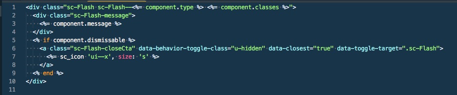
You can see how the component.message is passed into the dedicated space/ slot keeping this code flexible for reuse.
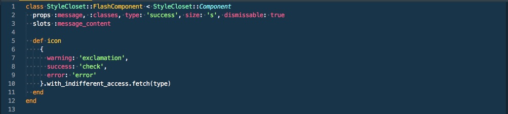
- A Ruby class (the behavior aside from any JavaScript): the class holds the “props” the component allows to be passed in as well as any methods needed for the view, similar to a presenter model. The props are a fancier attr_accessor with the bonus of being able to assign defaults. Additionally, all components can take a block, which is typically the content for the component. This allows the view to be reusable.
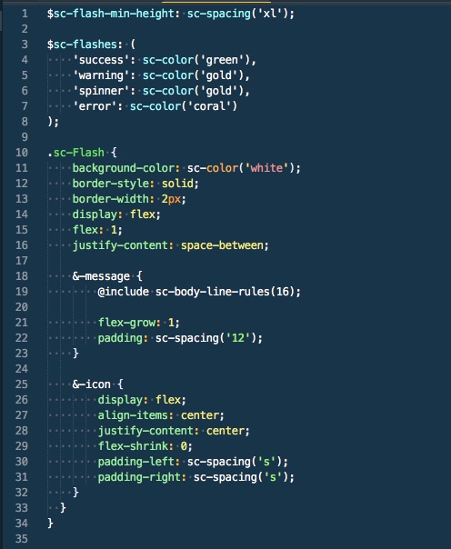
- CSS (the appearance): In this example, we use it to set things like the color, alignment and the border.
When we add new components or make changes, we update the gem (as well as the docs site associated with Style Closet) and simply release the new version. As we develop and experiment with new types of components, we test these bigger changes out in the real world by putting them behind a feature flag using our open source split testing framework, Test Track.
What does the future hold?
We’ve used UJS sprinkles in similar fashion to the rest of the Rails world over the years, but that has its limitations as we begin to design more complex behaviors and elements of our apps. Currently we’re focusing on building more intricate and and interactive components using React. A bonus of Style Closet is how well it’s able to host these React components since they can simply be incorporated into a view by being wrapped in a Style Closet component. This allows us to continue composing a UI with self contained building blocks. We’re always iterating on our solutions, so if you’re interested in expanding on or solving these types of problems with us, check out our career page!
Addition information
Since we introduced our internal Rails component code, a fantastic open-source project emerged, Komponent, as well as a really great and in-depth blog post on component systems in Rails from Evil Martians.